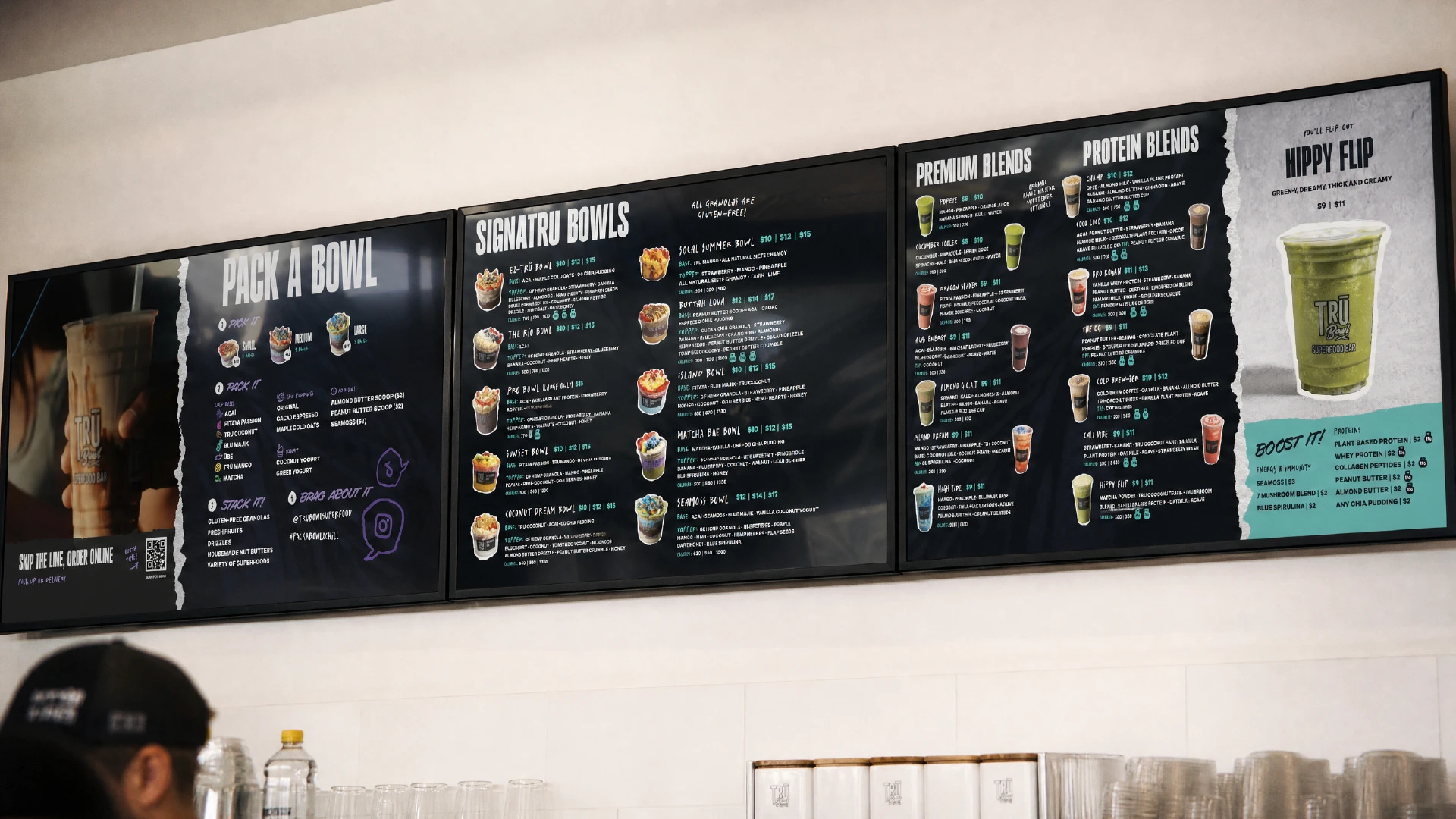
Three digital menu designs over top of a counterm, showing smoothies and superfood bowls

FAST CAsUAL RESTAURANT / franchise

Three digital menu designs over top of a counterm, showing smoothies and superfood bowls

FAST CAsUAL RESTAURANT / franchise

TRU BOWL REBRANDING

TRU BOWL REBRANDING

When a successful business no longer recognizes its own brand

Project Scope

Brand strategy / Brand Design / Logo DESIGN / Website Design Menu Design / Illustration / Social Media Design environmental design / packaging design

Challenge

Despite their growing popularity, TRU Bowl’s brand never kept up with the franchise’s rapid expansion, feeling disconnected from the brand’s personality and culture. The identity felt disconnected from the founder's vision, making it difficult to create a consistent and authentic brand experience across locations

Solution

Through an in-depth brand strategy process, we uncovered the values, personality, and positioning that had been missing from previous iterations of the brand. The result was a clearer foundation and a new identity that finally felt authentic to the business

Outcome

A refreshed franchise brand with a stronger point of view, greater internal alignment, and a visual identity built to support ongoing growth

ABOUT THE CLIENT

TRU Bowl Superfood Bar

A smoothie and superfood bar chain with roots in Southern California, TRU Bowl has expanded to over 20 locations in counting since its genesis in 2018. Young, edgy, and cool, the brand is known for its popular and creative superfood bowls and smoothies, and has a very active social media presence.

People love TRU Bowl, but the brand had never truly resonated with its owners. Though its products looked great, something about the brand had always felt ‘off’, disconnected from the vision its founders were trying to portray, no matter what they tried.

Competitors were all competing in the same arena. Bright, sun-soaked color palettes with a focus on minimalism and aspirational wellness imagery. TRU Bowl didn’t see things that way. TRU Bowl's personality was stronger, louder, and more expressive than the market around it—but the brand wasn't communicating any of it.

It turns out, brand strategy was always the missing ingredient.
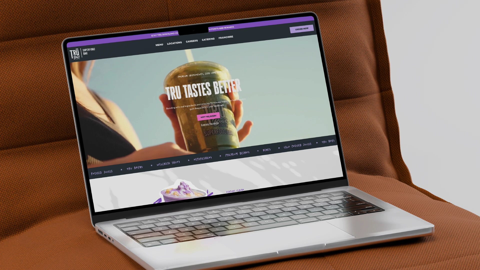
A beautiful website for a franchise smoothie bar
A juice label design for a red drink. The word JUCED is printed on top.
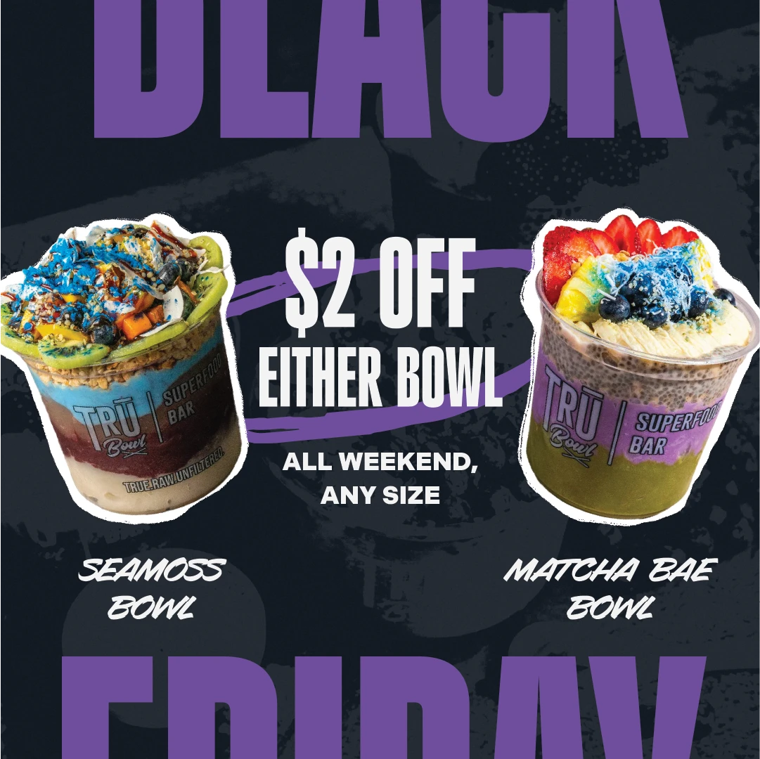
Social media design for TRU Bowl, showing 2 colorful superfood bowls and the words BLACK FRIDAY
Interior design showing a feature wall design with palm trees and the TRU Bowl logo in the background. There is a leather couch and bar in the foreground.

Brand Strategy

Creating a Memorable First Impression

It wasn’t until our first brand strategy session where things finally clicked for TRU Bowl. Questions they had never been asked before, around positioning, messaging, and diving deep into the client’s long-term vision for their brand yielded incredible results. Piece by piece, a new, more authentic TRU Bowl was being built.

Brand Strategy

Creating a Memorable First Impression

It wasn’t until our first brand strategy session where things finally clicked for TRU Bowl. Questions they had never been asked before, around positioning, messaging, and diving deep into the client’s long-term vision for their brand yielded incredible results. Piece by piece, a new, more authentic TRU Bowl was being built.

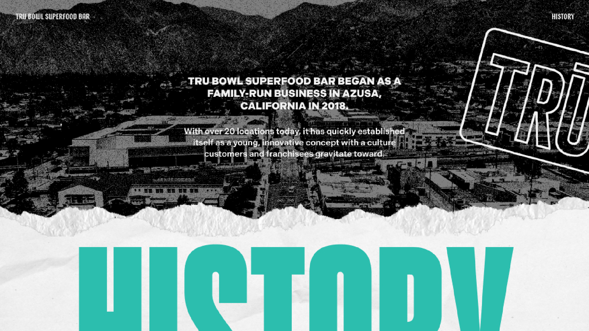
Brand story page from a pitch deck for a smoothie bar brand
A woman eating a superfood bowl with the TRU Bowl logo overlayed on top
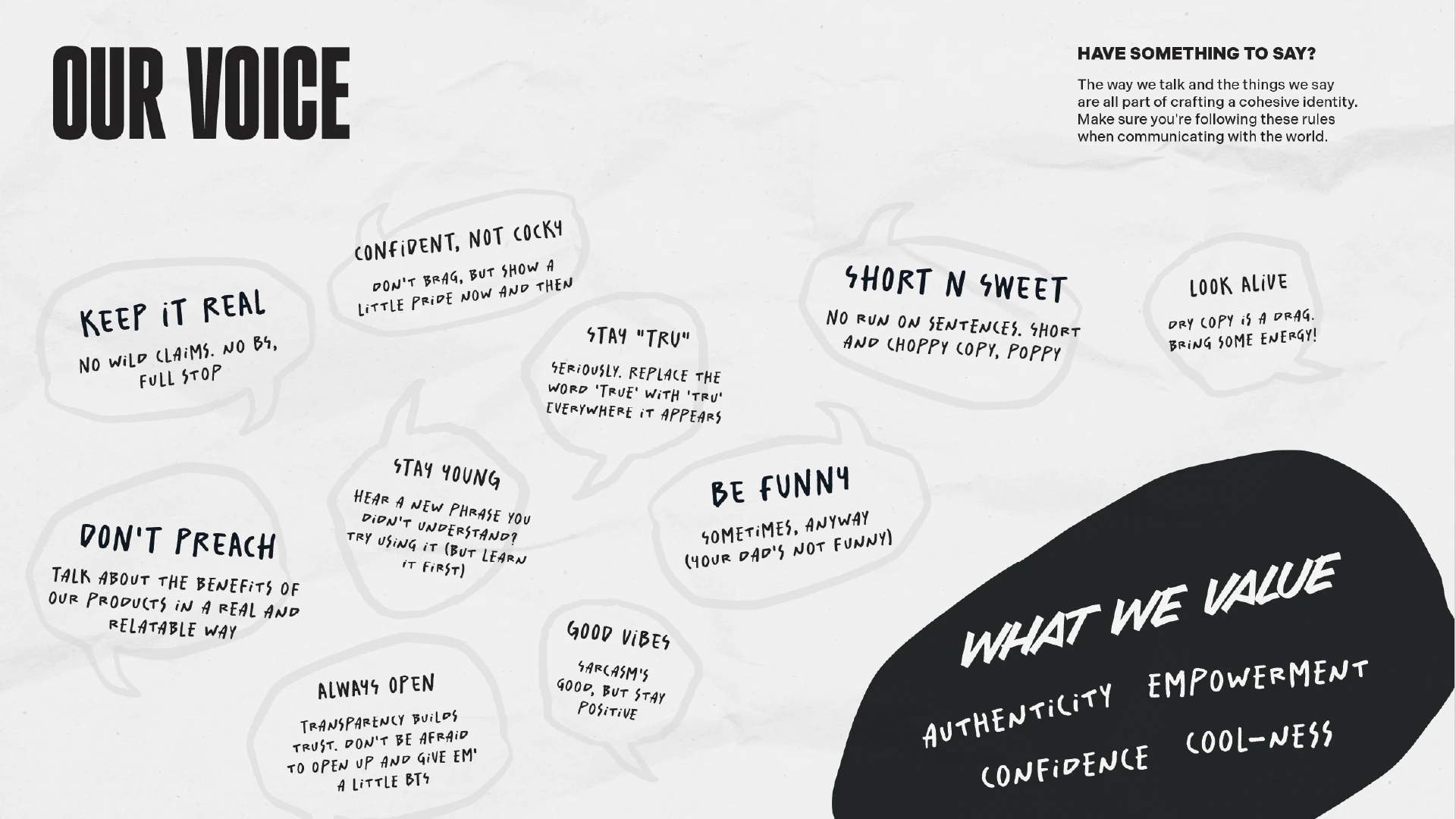
An example of the verbal identity for TRU Bowl

VISUAL IDENTITY

Reality Bites. And Sips.

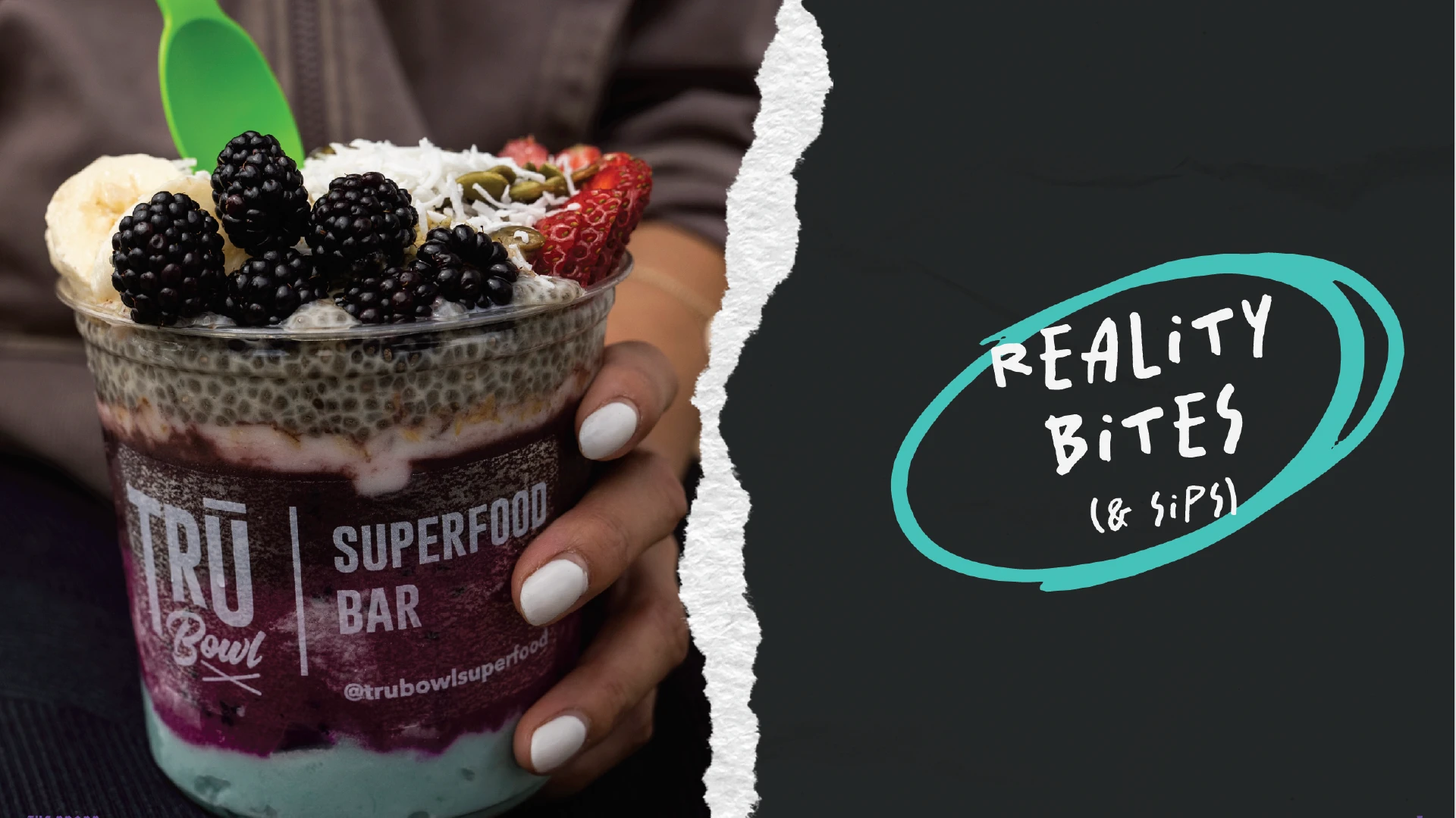
Starting a brand is always a little messy, and that’s something TRU Bowl knows well. We took that grit and dialed it up to eleven, painting a picture of their new visual identity that was rougher, edgier, and less polished than its predecessors. From scratchy textures and sketchy illustrations, to posterized graphics and expressive typography, the brand was finally catching up to its product.

VISUAL IDENTITY

Reality Bites. And Sips.

Starting a brand is always a little messy, and that’s something TRU Bowl knows well. We took that grit and dialed it up to eleven, painting a picture of their new visual identity that was rougher, edgier, and less polished than its predecessors. From scratchy textures and sketchy illustrations, to posterized graphics and expressive typography, the brand was finally catching up to its product.

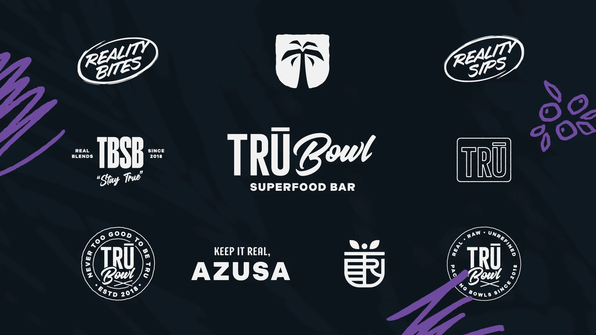
A page showing a variety of different logo designs for a smoothie and superfood bowl brand, TRU Bowl
The color palette from the visual identity for TRU Bowl
An illustrated pattern from the visual identity for TRU Bowl
A hand holding a superfood bowl, with a ripped paper graphic element and the words 'reality bites. And sips'
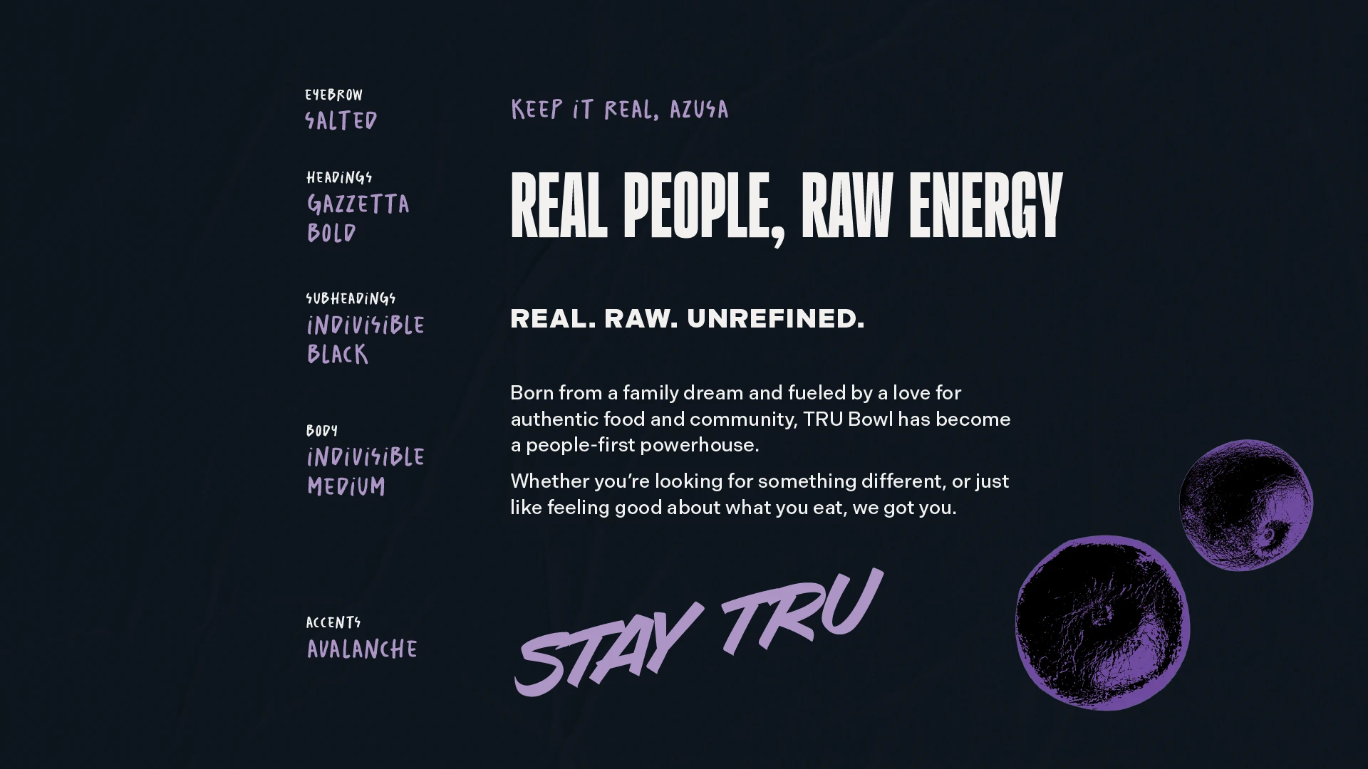
Typography from the visual identity for TRU Bowl
An example of messaging for an edgy health food brand

image styles

Less brand, more bowl

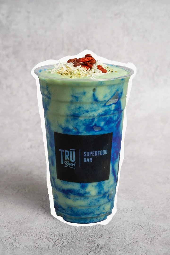
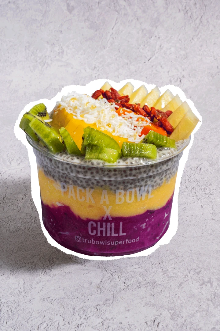
A highlight of the brand has always been its exceptional product photography — Bright, highly saturated layers of fruity goodness and crunchy toppings consistently dominate their feeds. By leaning in further with a monochromatic color palette (and some new highlights), we were able to keep their product in the limelight.

image styles

Less brand, more bowl

A highlight of the brand has always been its exceptional product photography — Bright, highly saturated layers of fruity goodness and crunchy toppings consistently dominate their feeds. By leaning in further with a monochromatic color palette (and some new highlights), we were able to keep their product in the limelight.

image styles

Less brand, more bowl

A highlight of the brand has always been its exceptional product photography — Bright, highly saturated layers of fruity goodness and crunchy toppings consistently dominate their feeds. By leaning in further with a monochromatic color palette (and some new highlights), we were able to keep their product in the limelight.

A vibrant product photo of a superfood bowl with a custom graphic texture applied
A woman holding a TRU Bowl smoothie with the logo prominently displayed
A hand holding a green smoothie with a label design reafing 'Let's go on a blender bender'
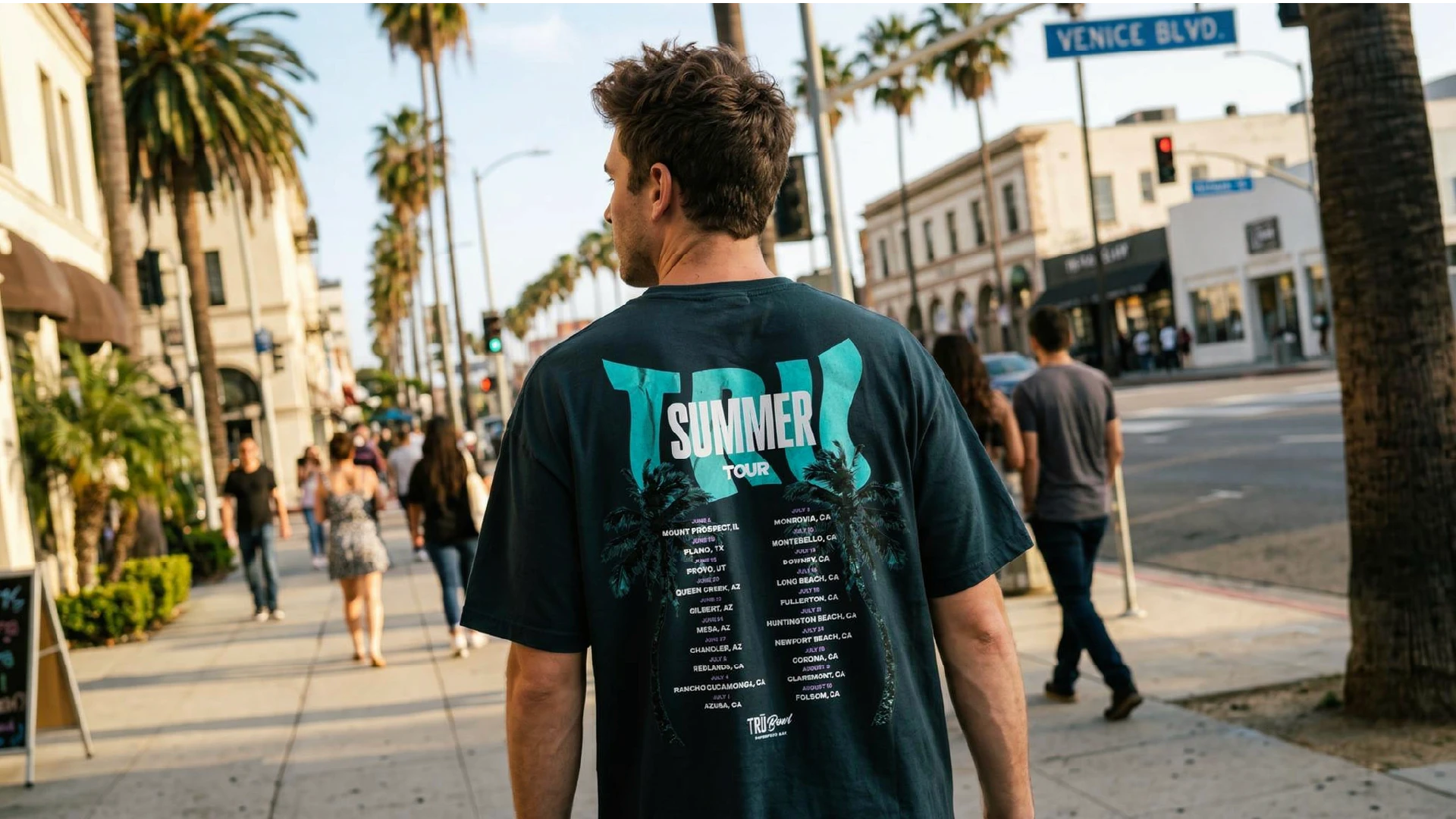
A man walking down the street showing off his t-shirt design. The design features palm trees, and the words 'TRU Summer Tour'

COLOR PALETTE

Repeatable, never predictable

TRU Bowl had been able to scale for nearly a decade without a strong, unified visual system. But as the franchise network expanded, it became harder to maintain consistency across locations, and the internal team found that their ideas were running dry.

By developing a cohesive set of brand guidelines and design standards, we created a system that connects every location under one visual language. Now, each franchise has a shared set of assets and rules to draw from, ensuring the brand shows up consistently across packaging, social media, and in-store experiences—no matter where it appears.

For the marketing team, this shift replaced guesswork with clarity. They now operate within a framework that protects consistency at scale while still allowing enough flexibility for local expression.

COLOR PALETTE

Repeatable, never predictable

TRU Bowl had been able to scale for nearly a decade without a strong, unified visual system. But as the franchise network expanded, it became harder to maintain consistency across locations, and the internal team found that their ideas were running dry.

By developing a cohesive set of brand guidelines and design standards, we created a system that connects every location under one visual language. Now, each franchise has a shared set of assets and rules to draw from, ensuring the brand shows up consistently across packaging, social media, and in-store experiences—no matter where it appears.

For the marketing team, this shift replaced guesswork with clarity. They now operate within a framework that protects consistency at scale while still allowing enough flexibility for local expression.

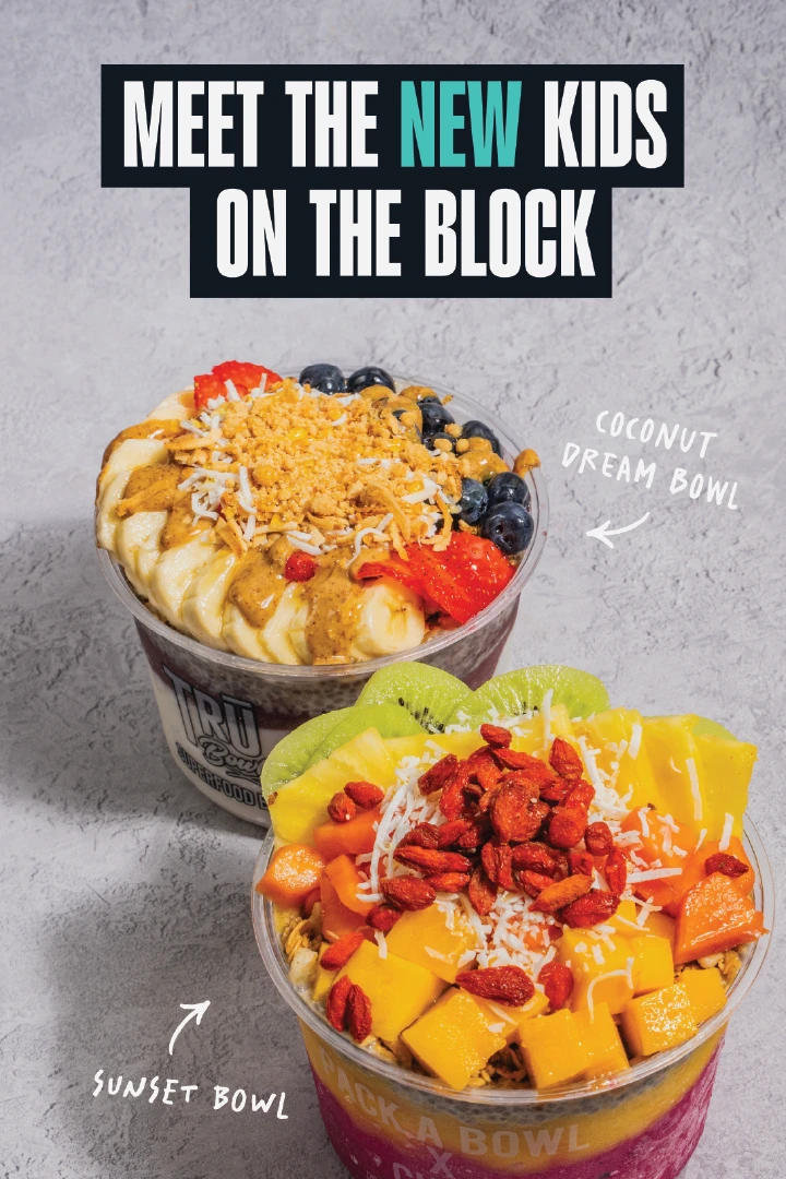
Social media example for a superfood and smoothie brand. This design shows two bowls and the text 'meet the new kids on the block'
Social media example for a superfood and smoothie brand. This design shows palm trees and the words 'keep it real south whittier'
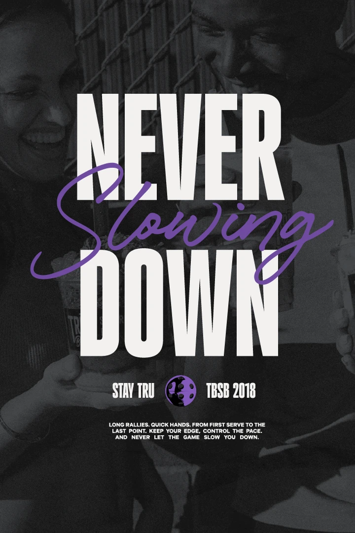
Social media example for a superfood and smoothie brand. This design shows friends with bowls and the words 'Never slowing down'
A nicely designed social media feed for TRU Bowl on a phone on a concrete surface
Staff apparel designs for TRU Bowl
Pickleball illustrations with the words 'Fueled different' overlayed
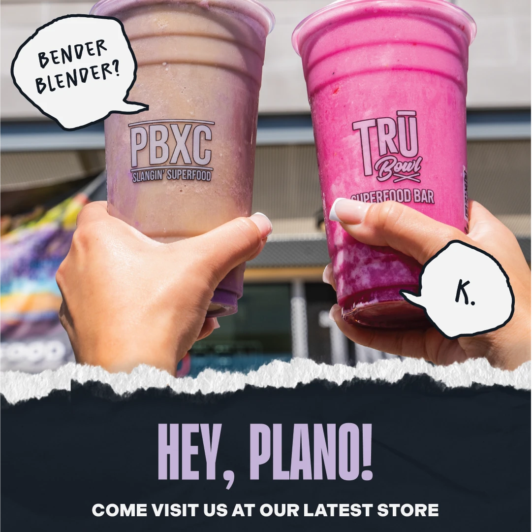
A social media design example for the TRU Bowl brand. This image shows two people cheersing their smoothies and the words 'Hey, Plano!'
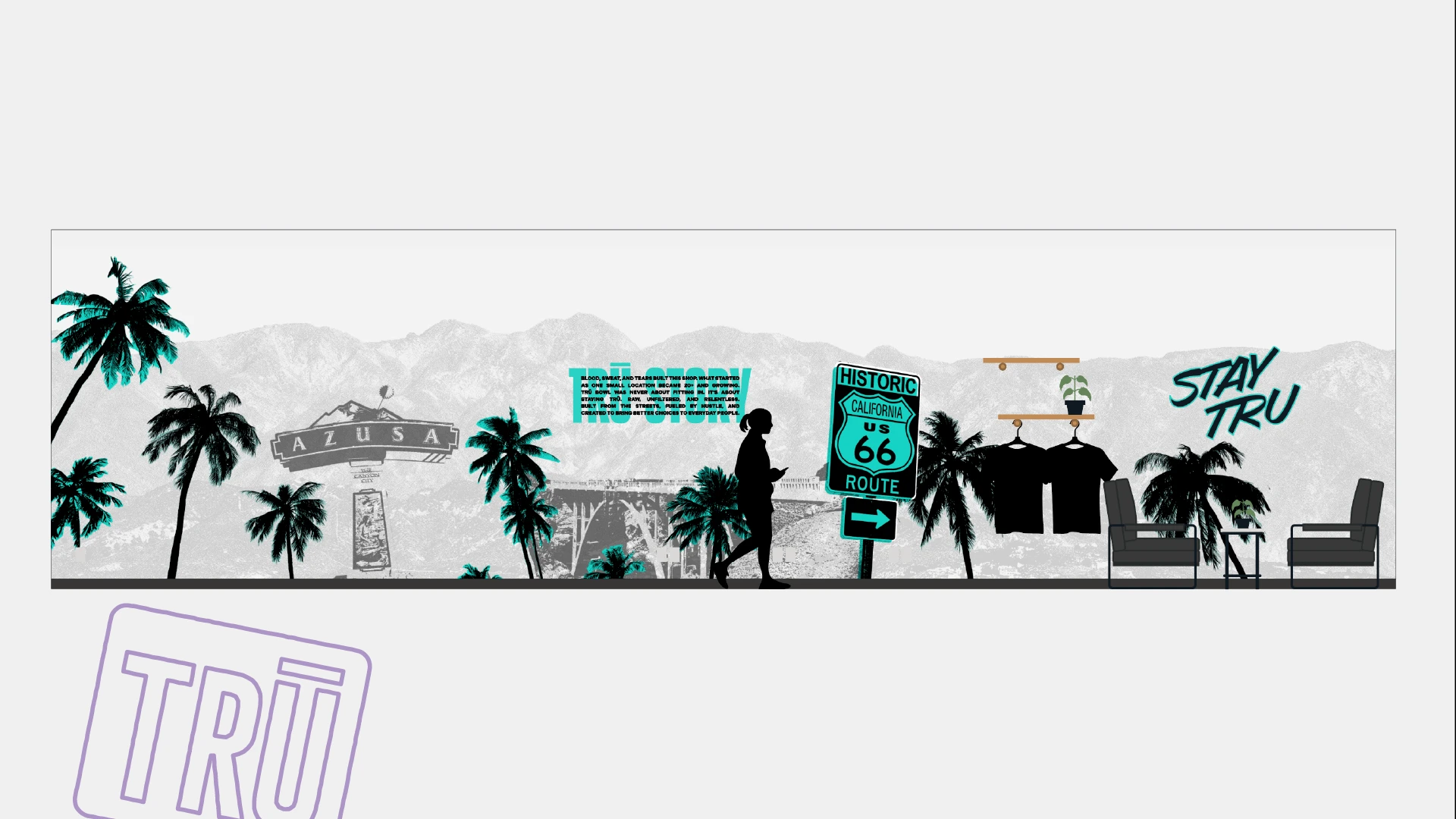
Interior design for TRU Bowl showing a grungy wall graphic with palm trees and mountains and the words 'STAY TRU'

WHAT HAPPENED?

THE RESULT

THE RESULT

More than a visual refresh, the rebrand gave TRU Bowl the confidence and consistency its founders had been chasing for years. By aligning the visual identity with the founders' vision, the brand now has the confidence, clarity, and consistency to support an expanding franchise network while standing apart in an increasingly crowded market.

"Krentz Creative Company has been AMAZING to work with. Steve is true to his word, easy going and focused. He has great intuitive design skills, but moreover, he is responsive, he has great collaborative skill sets capable of working with multiple professionals, he is extremely patient and gets the job done! After doing business with others, he is definitely a standout.”

"Krentz Creative Company has been AMAZING to work with. Steve is true to his word, easy going and focused. He has great intuitive design skills, but moreover, he is responsive, he has great collaborative skill sets capable of working with multiple professionals, he is extremely patient and gets the job done! After doing business with others, he is definitely a standout.”

Dolores Q, CLIENT

WHAT ARE YOU WAITING FOR?

WHAT ARE YOU WAITING FOR?

WHAT ARE YOU WAITING FOR?

Turn your product, story, and ambition into a brand customers recognize and trust.

Turn your product, story, and ambition into a brand customers recognize and trust.

A huge white Krentz Creative Company logo

© 2O26 Krentz Creative Co.

PRIVACY POLICY

TERMS OF USE

© 2O26 Krentz Creative Co.

PRIVACY POLICY

TERMS OF USE

© 2O26 Krentz Creative Co.

PRIVACY POLICY

TERMS OF USE