
CAFE / hospitality
Grounds & Rounds Branding
Grounds & Rounds Branding
How a firearm parts manufacturer expanded into hospitality without alienating its existing customers—or the new ones it hoped to attract.
Project Scope
Brand Strategy / Brand Design / Website Design / Menu Design Illustration / Social Media Design / Placemaking
Challenge
Create a brand for a premium café located inside a shooting range to attract firearms enthusiasts while feeling welcoming enough for entirely new customers
Solution
Rather than treating the café as a separate business, I identified shared values between both audiences and built a brand around those common ground experiences
Outcome
A hospitality brand that expanded the company’s reach, attracted a broader customer base, and complemented the parent brand without compromising its identity
ABOUT THE CLIENT
Grounds & Rounds
Some said it wasn't possible to bring stay-at-home moms and shooters together... but this brand says otherwise.
C+H Precision, a respected firearms parts manufacturer, was in the process of the biggest expansion in their history with plans to build a massive new manufacturing facility in Richmond Hill, Georgia. The facility would include a warehouse, pro shop, and shooting range—but also something entirely unexpected: a premium café.
The business had an interesting opportunity. Located just outside Savannah, there were few dedicated coffee shops nearby, giving Grounds & Rounds the opportunity to become the area's go-to café. They had already decided to aim high, offering a premium menu crafted by an executive chef. But they knew food and location alone wouldn’t put their new café on the map, and they also couldn’t rely on existing customers and shooters to give them the traffic their new café needed to succeed.
What they needed was an identity — An experience — that defied expectations, and offered something warm and hospitable for non-shooters, while capturing the interest of existing guests.
ABOUT THE CLIENT
Grounds & Rounds
Some said it wasn’t possible to bring stay-at-home moms and shooters together… but this brand says otherwise.
C+H Precision, a respected firearms parts manufacturer, was in the process of the biggest expansion in their history with plans to build a massive new manufacturing facility in Richmond Hill, Georgia. The facility would include a warehouse, pro shop, and shooting range—but also something entirely unexpected: a premium café.
The business had an interesting opportunity. Located just outside Savannah, there were few dedicated coffee shops nearby, giving Grounds & Rounds the opportunity to become the area’s go-to café. They had already decided to aim high, offering a premium menu crafted by an executive chef. But they knew food and location alone wouldn’t put their new café on the map, and they also couldn’t rely on existing customers and shooters to give them the traffic their new café needed to succeed.
What they needed was an identity — An experience — that defied expectations, and offered something warm and hospitable for non-shooters, while capturing the interest of existing guests.



BRAND STRATEGY
Finding common ground
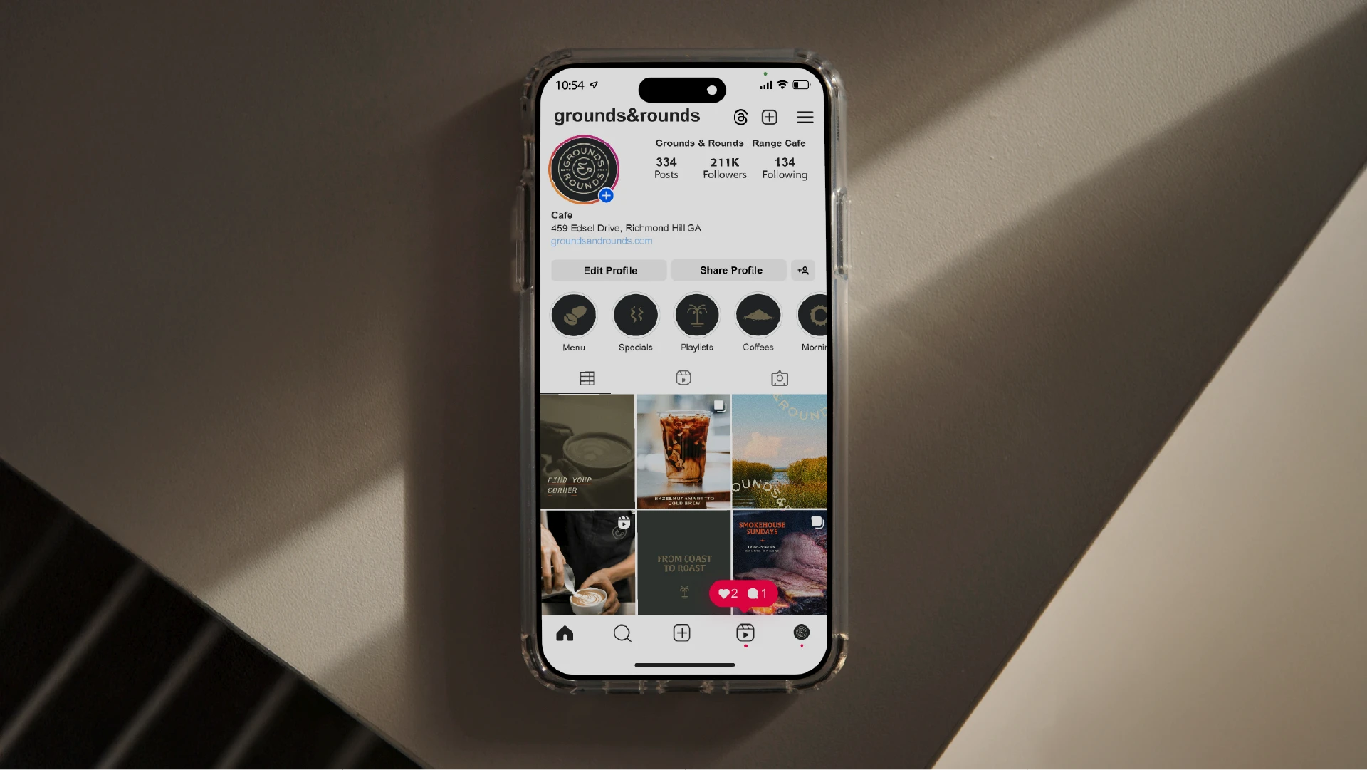
With a café being new territory for the client, they knew that the brand had to feel different from their existing, industrial style of branding, but weren’t sure how to get there.
However, an extensive brand strategy session with the team led to plenty of creative ideas that formed the solid foundation for this unconventional identity.
Understanding who their customers were and what they expected was the key to determining the future visual direction of the brand. They weren’t just shooters, or people in café: They were adventurers, creators, church-goers, road-trippers, office workers, and veterans.
While the customer groups looked very different on paper, they shared many of the same values: craftsmanship, community, local pride, and an appreciation for quality experiences. Those shared traits became the foundation of the brand strategy.
BRAND STRATEGY
Finding common ground
With a café being new territory for the client, they knew that the brand had to feel different from their existing, industrial style of branding, but weren’t sure how to get there.
However, an extensive brand strategy session with the team led to plenty of creative ideas that formed the solid foundation for this unconventional identity.
Understanding who their customers were and what they expected was the key to determining the future visual direction of the brand. They weren’t just shooters, or people in café: They were adventurers, creators, church-goers, road-trippers, office workers, and veterans.
While the customer groups looked very different on paper, they shared many of the same values: craftsmanship, community, local pride, and an appreciation for quality experiences. Those shared traits became the foundation of the brand strategy.


VISUAL IDENTITY
Nature, naturally
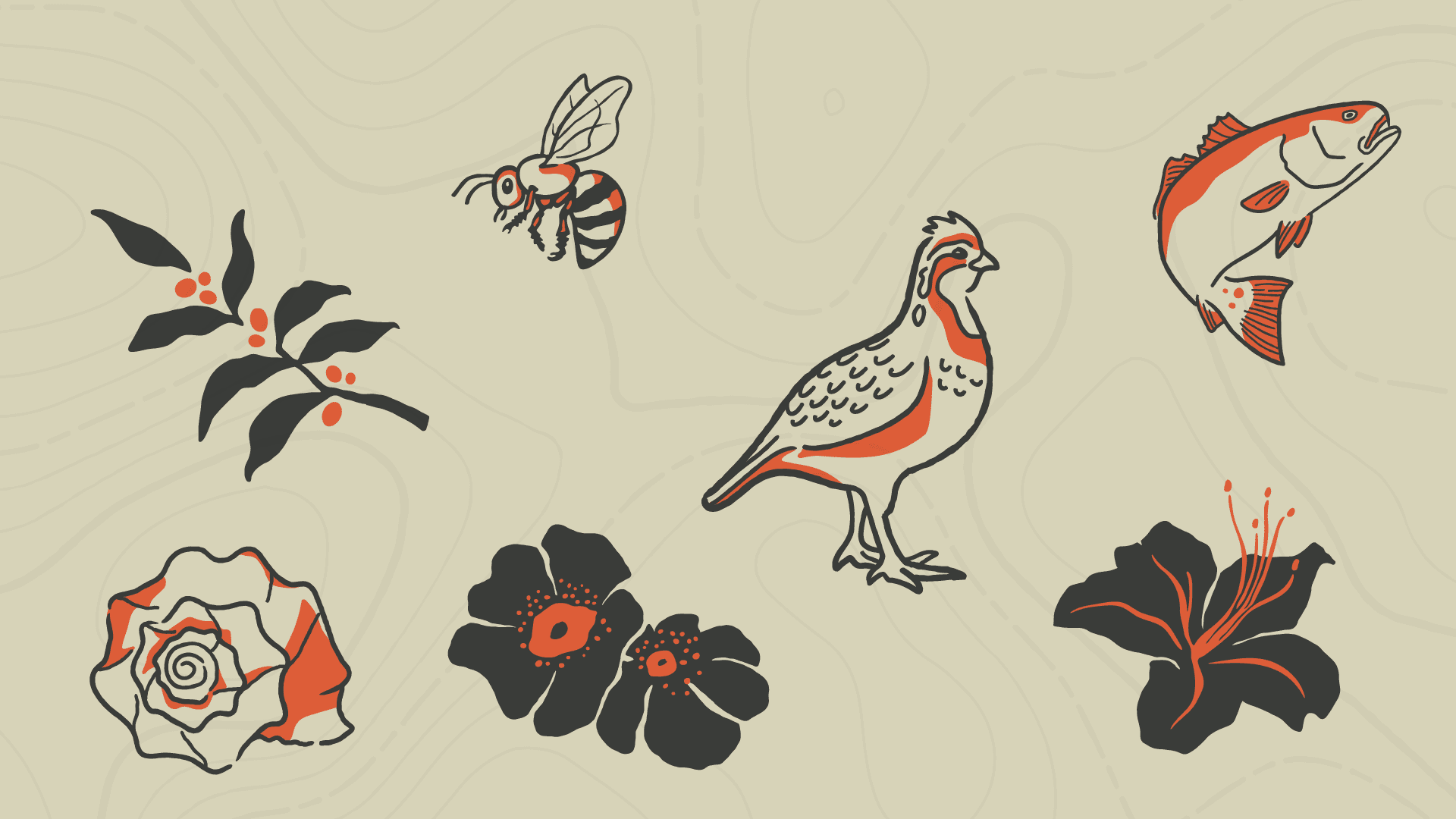
Rather than leaning into industrial or tactical aesthetics, the identity borrowed from the beautiful, natural landscape of coastal Georgia. Warm, comforting, and expected of a café, but also familiar enough to attract seasoned shooters.
Illustrations were inspired by Georgia’s state flora and fauna, representing the client’s affinity for their state and the people they serve, and connecting with them in an imperfect, human way.
VISUAL IDENTITY
Nature, naturally
Rather than leaning into industrial or tactical aesthetics, the identity borrowed from the beautiful, natural landscape of coastal Georgia. Warm, comforting, and expected of a café, but also familiar enough to attract seasoned shooters.
Illustrations were inspired by Georgia’s state flora and fauna, representing the client’s affinity for their state and the people they serve, and connecting with them in an imperfect, human way.
VISUAL IDENTITY
Nature, naturally
Rather than leaning into industrial or tactical aesthetics, the identity borrowed from the beautiful, natural landscape of coastal Georgia. Warm, comforting, and expected of a café, but also familiar enough to attract seasoned shooters.
Illustrations were inspired by Georgia’s state flora and fauna, representing the client’s affinity for their state and the people they serve, and connecting with them in an imperfect, human way.




Logo Design
A stamp of approval
The primary logo combines a coffee cup ampersand with the stamp found on the base of a bullet casing. A subtle bridge between both sides of the business, and the kind of detail enthusiasts appreciate that still feels approachable and meaningful to everyone else.
Logo Design
A stamp of approval
The primary logo combines a coffee cup ampersand with the stamp found on the base of a bullet casing. A subtle bridge between both sides of the business, and the kind of detail enthusiasts appreciate that still feels approachable and meaningful to everyone else.
Logo Design
A stamp of approval
The primary logo combines a coffee cup ampersand with the stamp found on the base of a bullet casing. A subtle bridge between both sides of the business, and the kind of detail enthusiasts appreciate that still feels approachable and meaningful to everyone else.

Menu Design
A scalable menu design crafted with intention
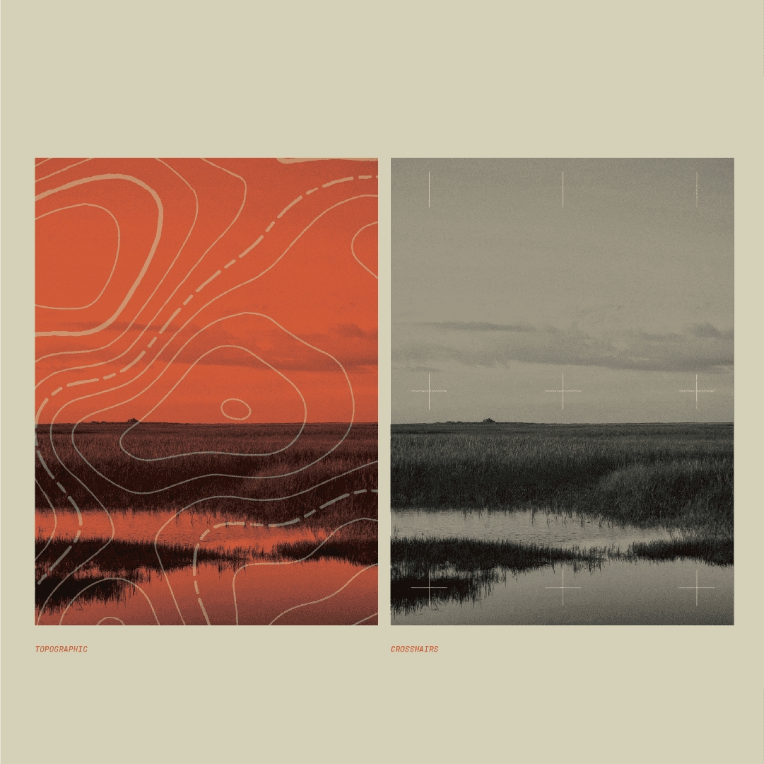
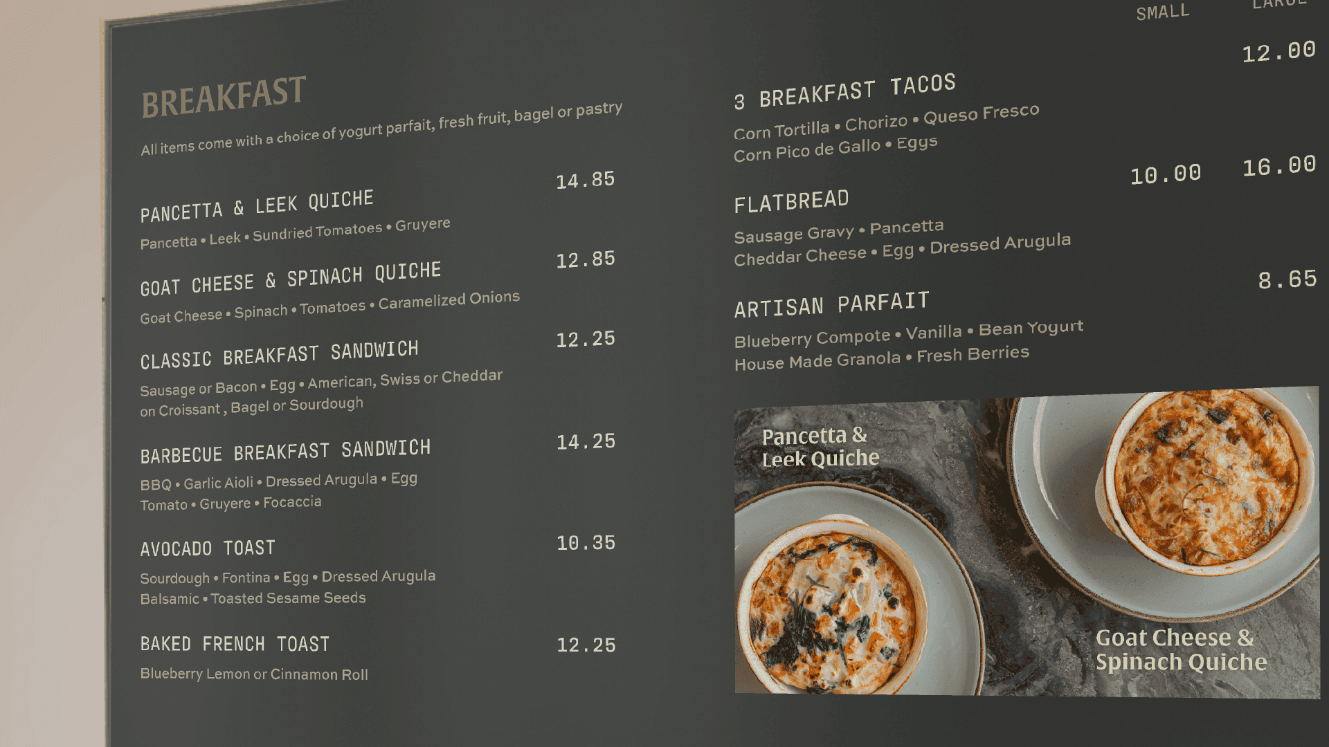
Comprised of three stackable menus featuring grainy Georgia-inspired landscapes and clearly delineated by category, they look great on their own, and even better together.
Color-coded, complimentary, and uncompromising on quality, the menu system we created elevates expectations for what's possible in a gun range cafe, while reinforcing its premium positioning with its tactile nature.
Menu Design
A scalable menu design crafted with intention
Comprised of three stackable menus featuring grainy Georgia-inspired landscapes and clearly delineated by category, they look great on their own, and even better together.
Color-coded, complimentary, and uncompromising on quality, the menu system we created elevates expectations for what’s possible in a gun range cafe, while reinforcing its premium positioning with its tactile nature.




WHAT HAPPENED?
THE RESULT
THE RESULT
Since launching in 2025, Grounds & Rounds has established itself as more than "the café inside the gun range." The brand creates a welcoming first impression for first-time visitors while reinforcing the quality and professionalism already associated with C+H Precision. By balancing familiarity with approachability, the café has become a destination for both loyal customers and the surrounding community.
Since launching in 2025, Grounds & Rounds has established itself as more than “the café inside the gun range.” The brand creates a welcoming first impression for first-time visitors while reinforcing the quality and professionalism already associated with C+H Precision. By balancing familiarity with approachability, the café has become a destination for both loyal customers and the surrounding community.
"Let me tell you how much I appreciate the hard work. I'm so happy we started this process with you."
“Let me tell you how much I appreciate the hard work. I’m so happy we started this process with you.”
BUCK H, CLIENT
WHAT ARE YOU WAITING FOR?
WHAT ARE YOU WAITING FOR?
Turn your product, story, and ambition into a brand customers recognize and trust.
Turn your product, story, and ambition into a brand customers recognize and trust.
MORE BRANDS WITH BITE




© 2O26 Krentz Creative Co.
PRIVACY POLICY
TERMS OF USE
© 2O26 Krentz Creative Co.
PRIVACY POLICY
TERMS OF USE
© 2O26 Krentz Creative Co.
PRIVACY POLICY
TERMS OF USE