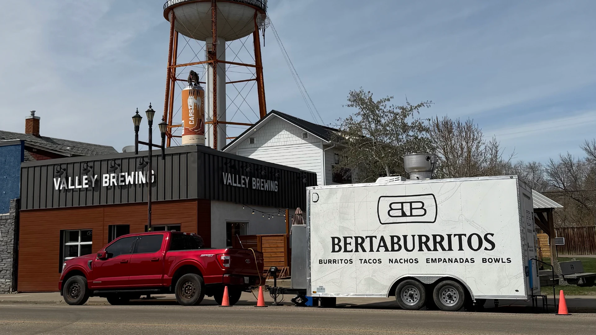
BertaBurritos food truck with custom restaurant branding parked outside Drum Distilling Co. in Drumheller, Alberta

RESTAURANT / FOOD TRUCK

BERTABURRITOS BRANDING

BERTABURRITOS BRANDING

How a beloved food truck embraced its Alberta roots to become a distinctive Latin American restaurant brand built for its next chapter.

Project Scope

Brand Strategy / Brand Design / Website Design / Menu Design Illustration / Social Media Design / SIGNAGE / VEHICLE WRAP DESIGN

Challenge

Create a brand capable of carrying BertaBurritos from food trailer to permanent restaurant without losing what made it special.

Solution

Blend Venezuelan heritage with Alberta’s rugged spirit to create a premium Latin-American brand with a personality all its own.

Outcome

A distinctive, scalable brand that brought BertaBurritos’ Venezuelan roots and its Alberta home together, transforming BertaBurritos from a food trailer into a brand ready to go wherever the road takes them.
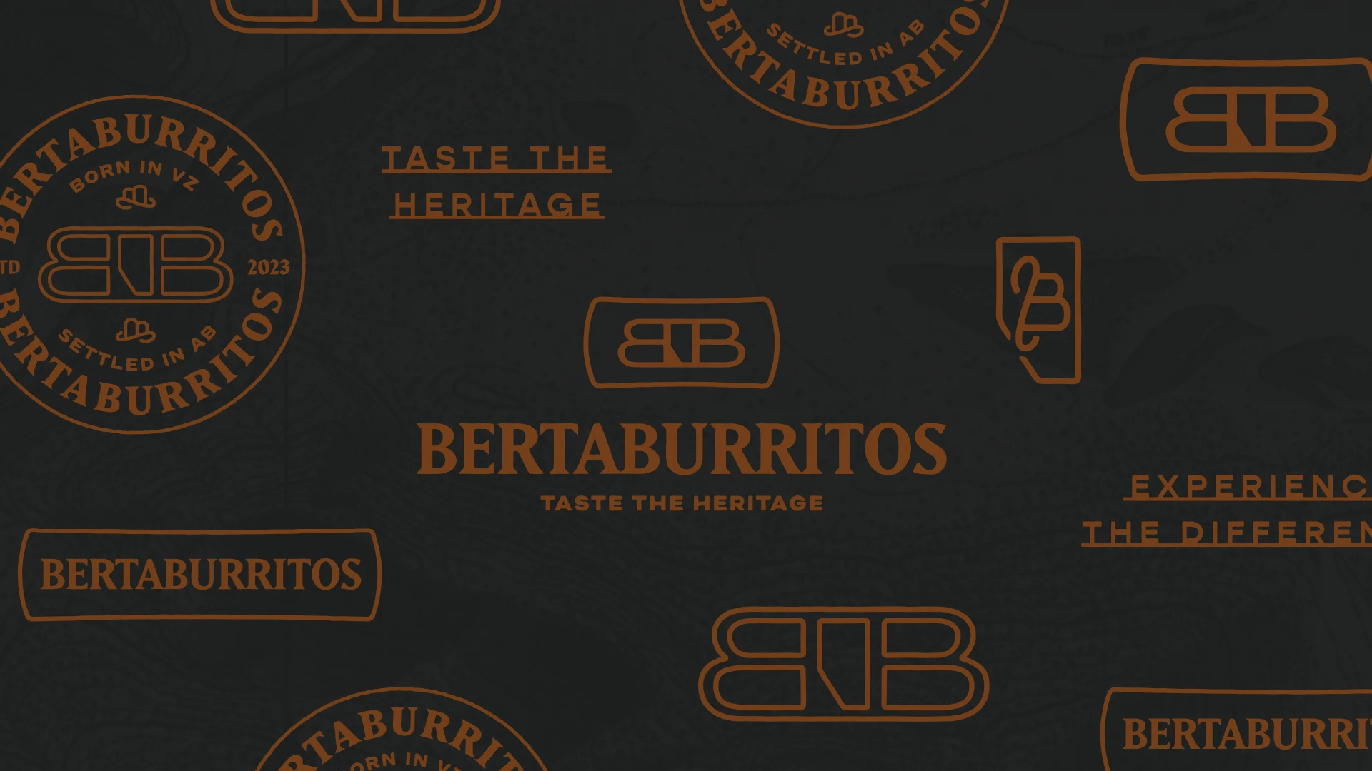
BertaBurritos branded pattern featuring the restaurant's logo, typography and visual identity

ABOUT THE CLIENT

BertaBurritos

A mainstay in downtown Drumheller, Alberta, BertaBurritos has operated a successful food trailer for the past few years. So popular, in fact, that they caught the attention of Drum Distilling Co., the Drumheller Valley’s most recognizable (and only) distillery. Without any food offering of their own, BertaBurritos’ delicious menu and welcoming personalities offered a great opportunity for both businesses to increase their customer base.

Seeing an opportunity to take the business into its next chapter, BertaBurritos reached out to me to create a flavour-focused restaurant brand identity rooted in Venezuelan heritage and deeply connected to their new home in Alberta.

Unlike numerous Mexican fast-casual restaurants dotting Alberta's landscape, BertaBurritos was offering something entirely different: a premium, sit-down experience with a meticulously developed menu, crafted over generations with love.

So that's exactly what we made.

Drumheller landscape photograph incorporated into the BertaBurritos visual identity
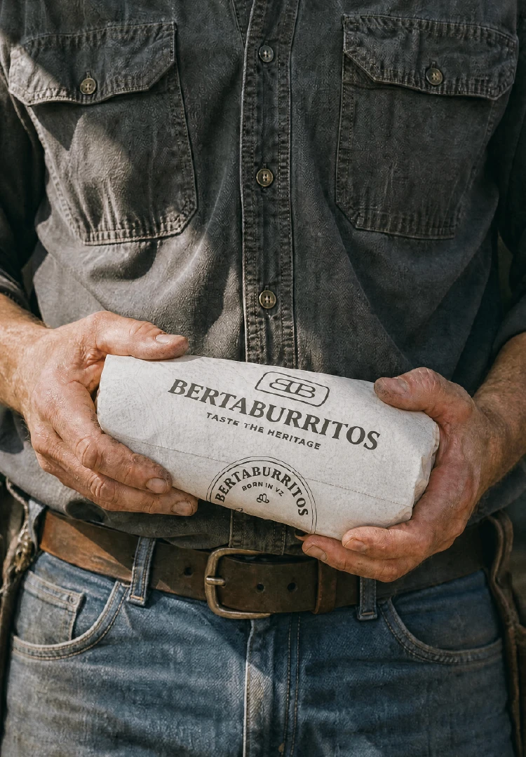
BertaBurritos burrito wrapped in custom branded packaging
Vintage-inspired cowboy photograph used in the BertaBurritos restaurant brand identity
Business cards for a gun range cafe

BRAND STRATEGY

The Cowboy Culture Connection

The fusion of Venezuelan and Albertan cultures made for several unexpected overlaps that further reinforced the themes of heritage and belonging.

From Venezuelan llanero culture and Alberta's cowboy heritage, to vast landscapes and native flora, there were plenty of opportunities to find common ground and establish a Western-themed identity with Latin-American roots.

The result was a premium restaurant identity that felt rugged, yet warm. Understated, yet adventurous.

BRAND STRATEGY

The Cowboy Culture Connection

The fusion of Venezuelan and Albertan cultures made for several unexpected overlaps that further reinforced the themes of heritage and belonging.

From Venezuelan llanero culture and Alberta's cowboy heritage, to vast landscapes and native flora, there were plenty of opportunities to find common ground and establish a Western-themed identity with Latin-American roots.

The result was a premium restaurant identity that felt rugged, yet warm. Understated, yet adventurous.

Business cards for a gun range cafe

VISUAL IDENTITY

Stay a while

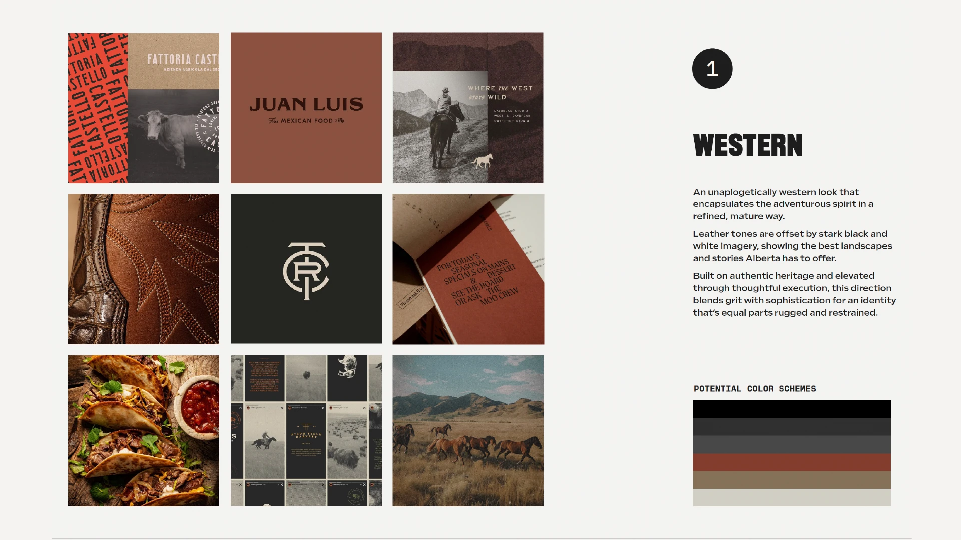
Many Latin-American restaurants in Canada use interchangeable iconography. Remove the logo, and each brand is often indistinguishable from its competitors. That led us to pursue a dusty Western aesthetic that felt less polished, and far more human.

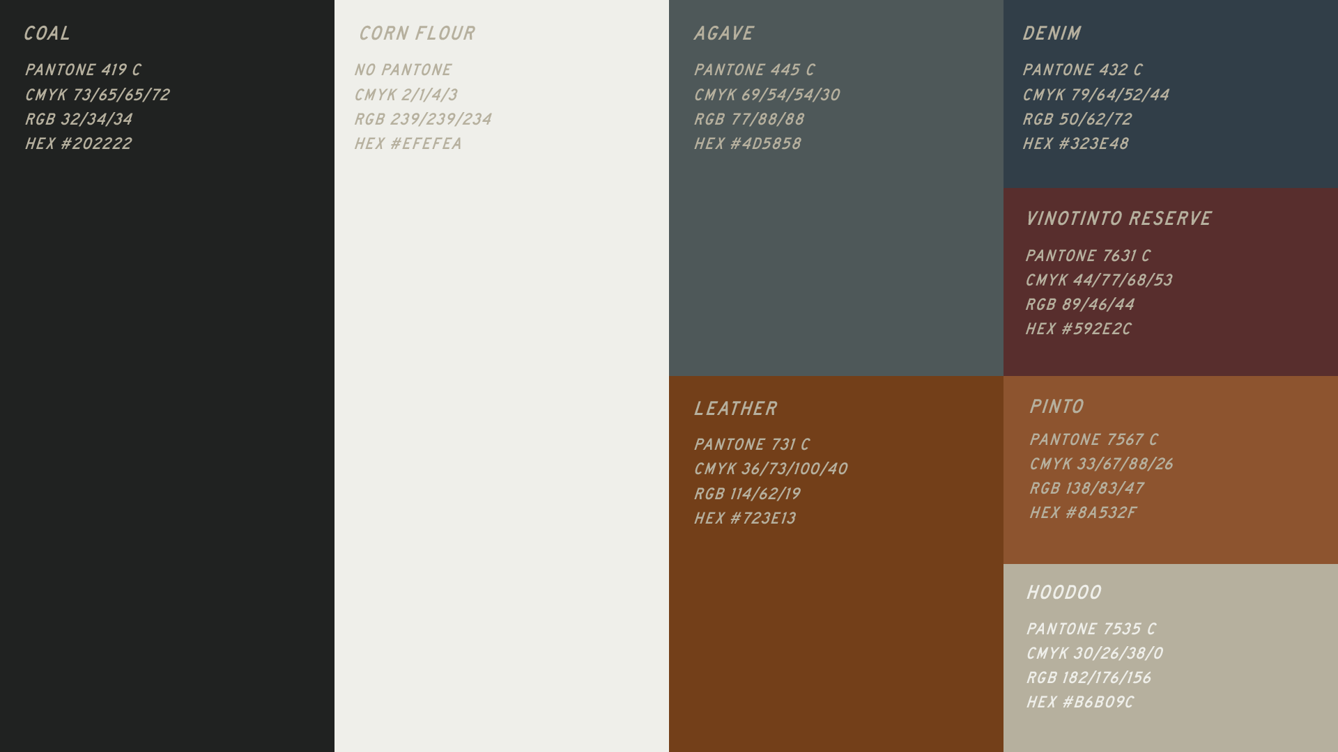
Leaning into a mature color palette, black and white photography, and grounded, imperfect typography, gave the brand a sense of warmth and place that felt completely intentional, rather than showy and loud.

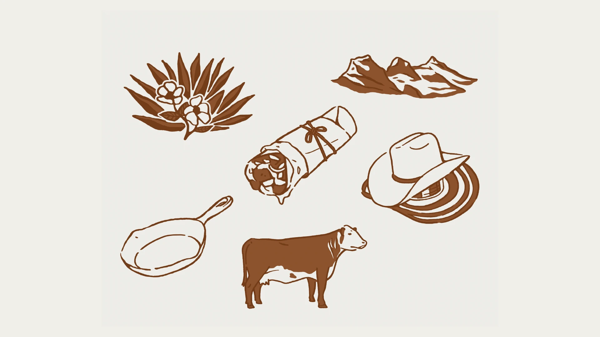
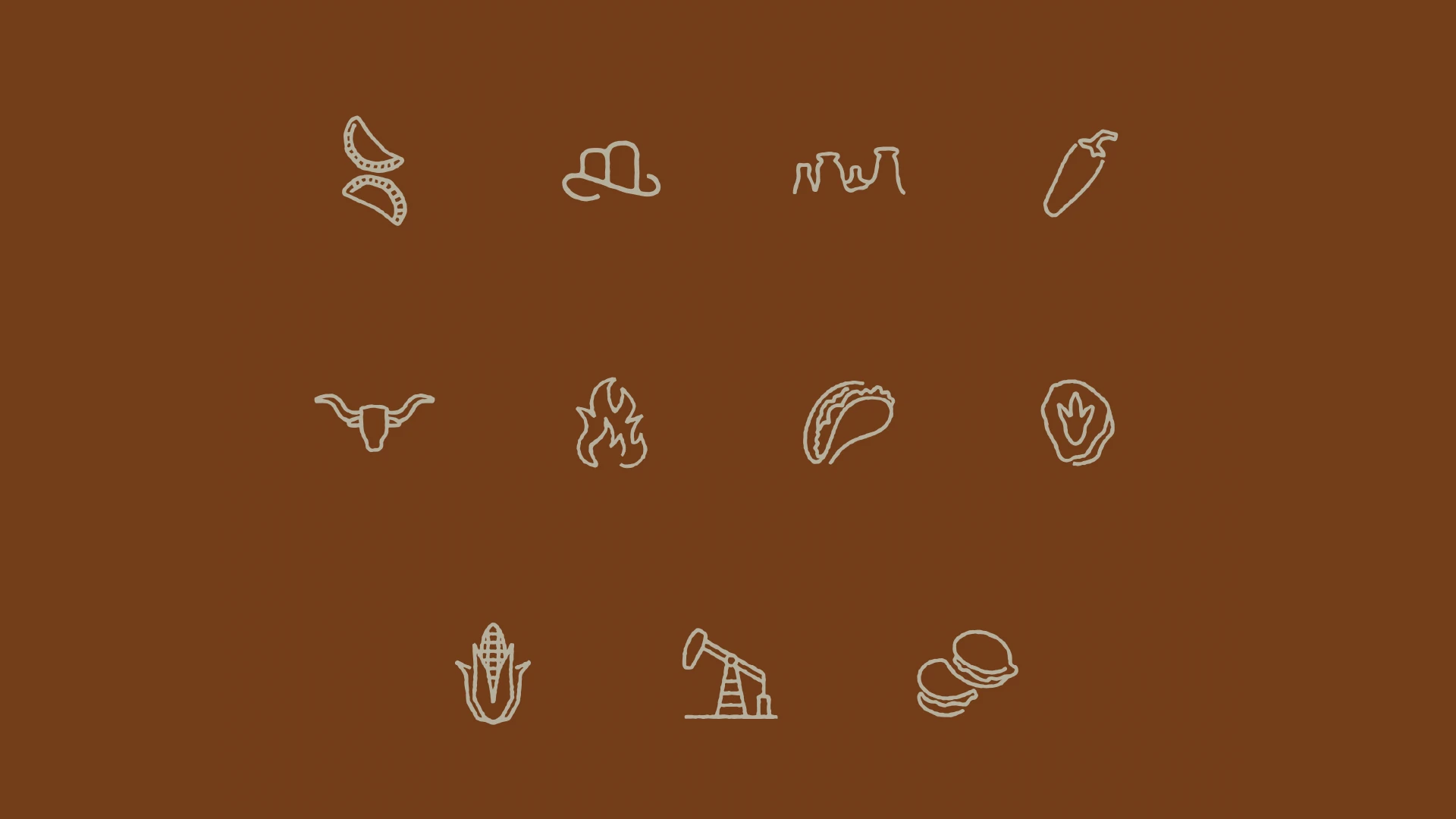
Hand-drawn illustrations with roughened linework brought both sides of the brand together: cattle, cowboy hats, frying pans, and burritos sit alongside achiote, agave, mountains and Alberta's wildrose for a complete story that brings together heritage, hospitality and a strong sense of place.

VISUAL IDENTITY

Stay a while

Many Latin-American restaurants in Canada use interchangeable iconography. Remove the logo, and each brand is often indistinguishable from its competitors. That led us to pursue a dusty Western aesthetic that felt less polished, and far more human.

Leaning into a mature color palette, black and white photography, and grounded, imperfect typography, gave the brand a sense of warmth and place that felt completely intentional, rather than showy and loud.

Hand-drawn illustrations with roughened linework brought both sides of the brand together: cattle, cowboy hats, frying pans, and burritos sit alongside achiote, agave, mountains and Alberta's wildrose for a complete story that brings together heritage, hospitality and a strong sense of place.

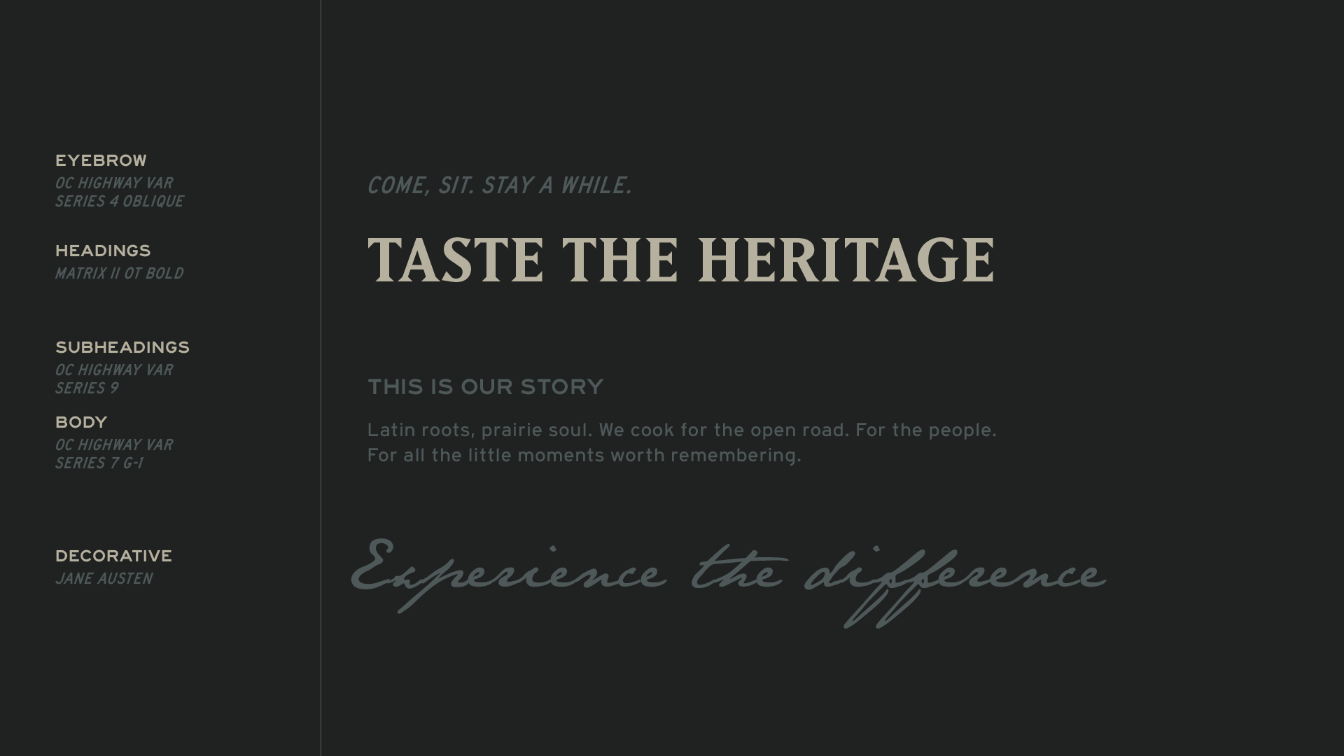
BertaBurritos brand messaging and typography
BertaBurritos custom illustrations combining Venezuelan and Alberta-inspired imagery
Vintage horse photograph style used as part of the BertaBurritos visual identity
BertaBurritos brand colour palette featuring earthy, dusty tones inspired by Alberta and Venezuelan landscapes
Custom BertaBurritos icon set featuring Western and Latin American-inspired catlebranded illustrations

Logo Design

Consider it Wrapped

The logo ties the brand together neatly, featuring two interlocking B’s, creating an Alberta-shaped negative space between them. With a logomark reminiscent of a cattle brand, its badge shape also hints at the shape of a burrito, bringing the concept full circle.

Logo Design

Consider it Wrapped

The logo ties the brand together neatly, featuring two interlocking B’s, creating an Alberta-shaped negative space between them. With a logomark reminiscent of a cattle brand, its badge shape also hints at the shape of a burrito, bringing the concept full circle.

Logo Design

Consider it Wrapped

The logo ties the brand together neatly, featuring two interlocking B’s, creating an Alberta-shaped negative space between them. With a logomark reminiscent of a cattle brand, its badge shape also hints at the shape of a burrito, bringing the concept full circle.

BertaBurritos logo system showing primary logo, alternate marks and supporting brand lockups

GRAPHIC DESIGN

Worth the Journey

Drumheller, Alberta is known as a destination for adventure seekers. And with exploration becoming such a natural theme for the brand, I wanted to dig a little deeper.

One unexpected ingredient in this restaurant’s brand identity became its vintage topographical maps, curated from the Glenbow Museum’s Creative Commons library. Used as background textures across the trailer wrap, menus, and packaging, they bring an unmistakably Albertan perspective to the brand while evoking the feeling of heading somewhere worth finding.

It's a subtle nod to place, but an important one.
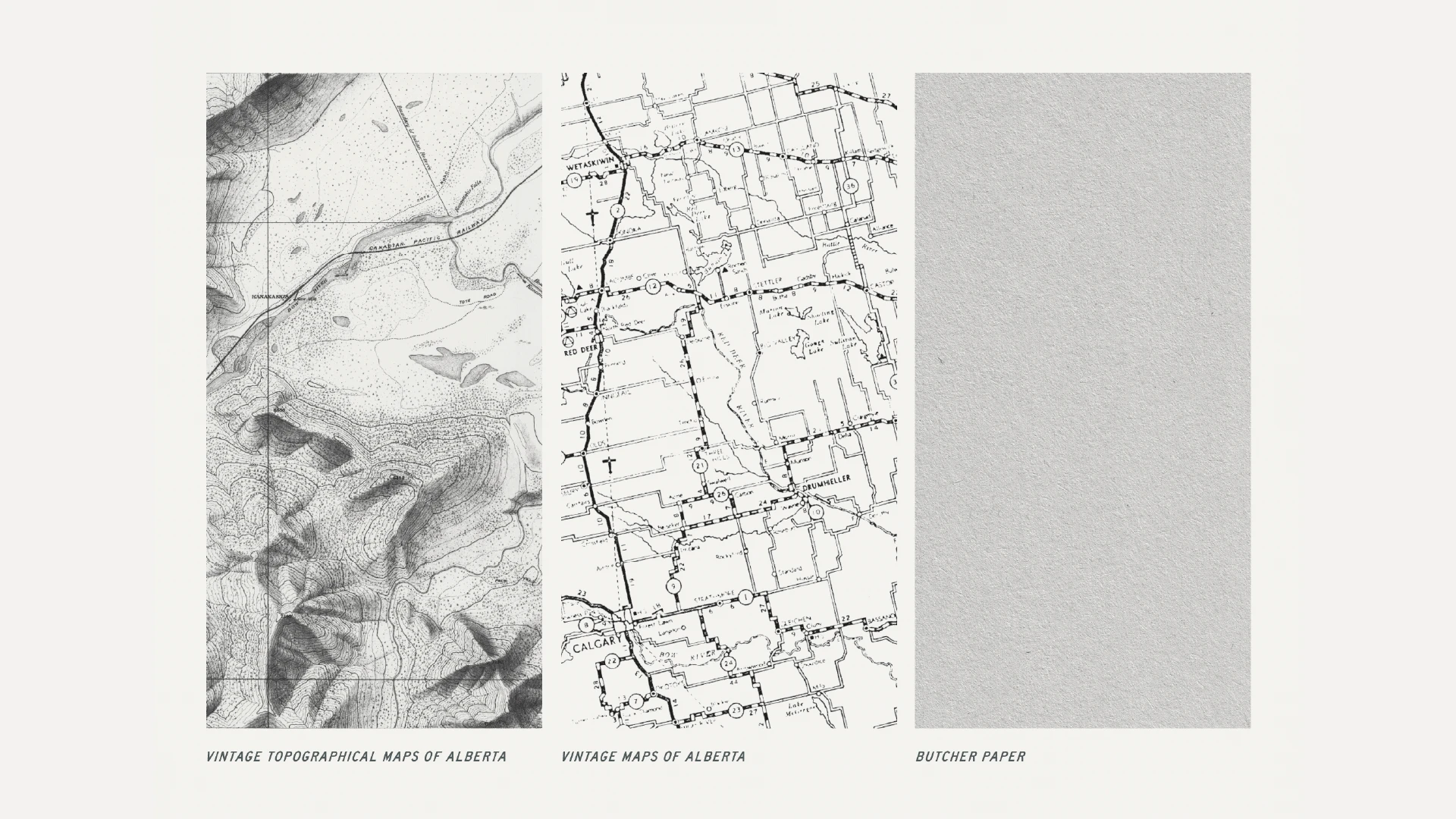
Vintage Alberta topographical maps used as graphic textures in the BertaBurritos brand identity

FOOD TRUCK DESIGN

Built for the Open Road

Part storefront. Part billboard. And an integral part of the business.

The food truck was where BertaBurritos got its start, so it made sense for it to become one of the biggest expressions of the new identity. The custom vehicle wrap combines the brand’s illustrations, typography, colour palette, archival map textures and messaging into a moving (or stationary) piece of the brand, not tied to a single location.

Functionality also played a key role. The truck’s previous black exterior absorbed a lot of heat, so it was important to invert the colour scheme and go full-white for the new wrap. Not only did this help keep employees cooler, it also increased the truck’s visibility from greater distances.
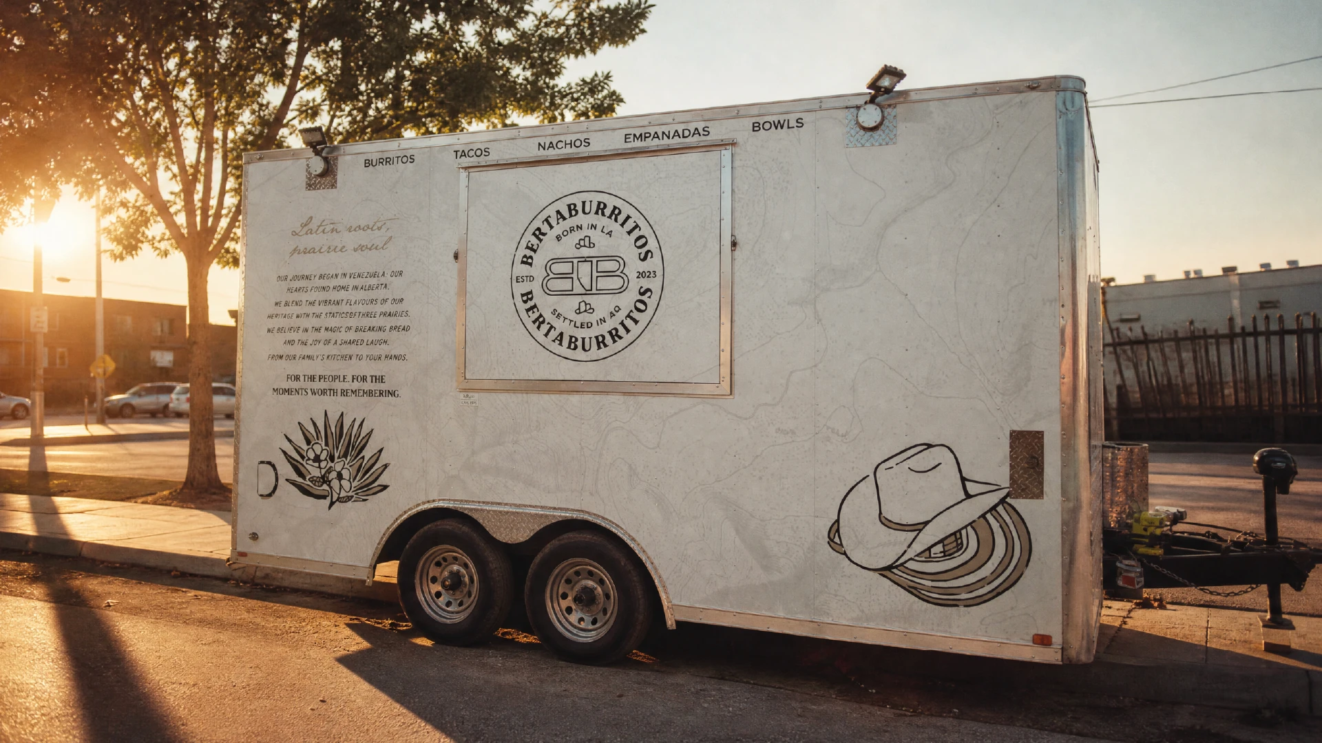
BertaBurritos food truck featuring its custom vehicle wrap and restaurant brand identity in Drumheller, Alberta
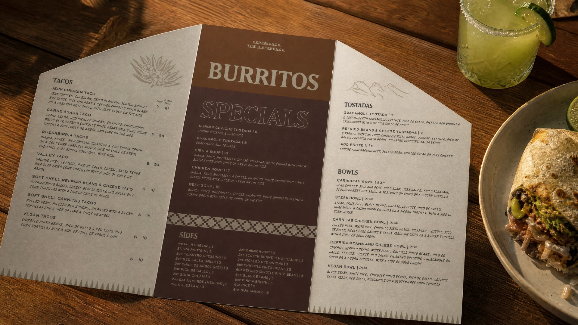
BertaBurritos restaurant menu featuring burritos, specials and Latin American-inspired dishes

MENU DESIGN

An Unwrappable Menu Design Experience

The menu is often the flagship touchpoint for a restaurant—the piece a customer spends the most time with outside of the food itself. That’s why I always try to push beyond simply making something functional and aim to create a memorable experience.

For BertaBurritos, I took things to the next level.

The flagship menu was a custom tri-fold menu with angled cuts on either side, allowing it to fold into a shape resembling a burrito. When opened, the experience continues, revealing a series of smaller menus, including a kids’ menu, features, and a standalone burrito menu. Playful without being gimmicky, it’s a functional piece of restaurant menu design that becomes another opportunity to share the brand’s story with its guests, and invite them into its world.

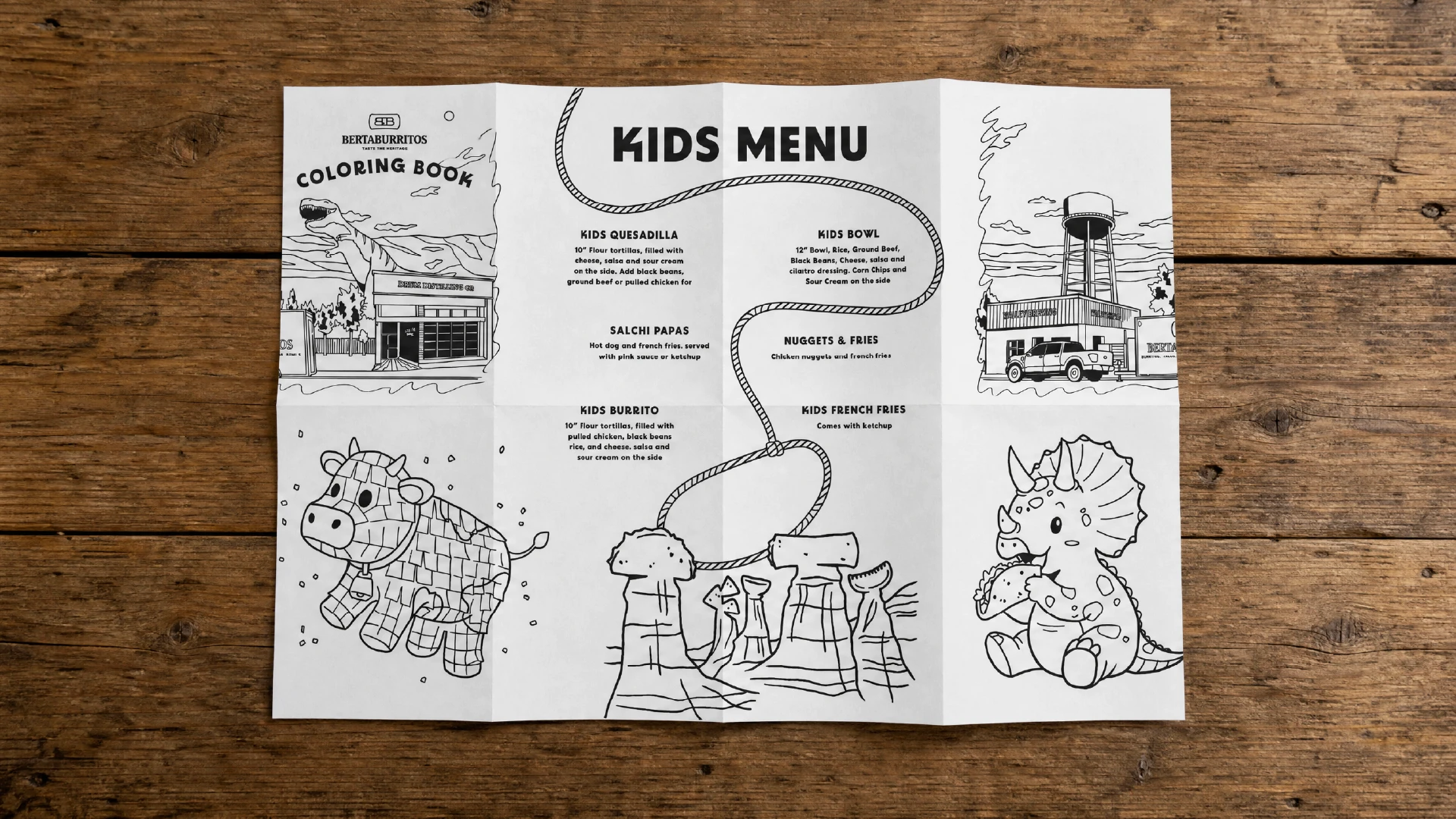
Other menus followed the same philosophy. The kids’ menu unfolded into a 16-page map, complete with colouring pages and a redeemable stamp-collection passport tied to the brand’s future plans.

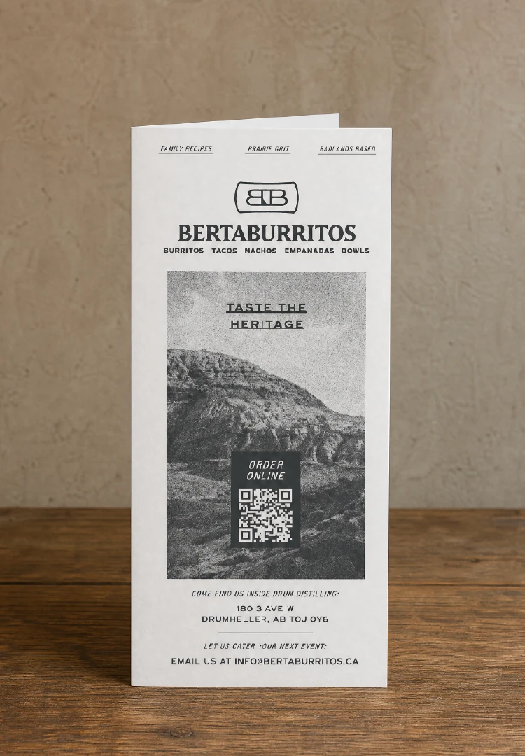
Custom BertaBurritos tri-fold restaurant menu designed to resemble a wrapped burrito
BertaBurritos branded menu featuring the restaurant logo, food photography and Drumheller imagery
BertaBurritos custom menu design featuring branded typography, Alberta landscape imagery and a burrito
BertaBurritos kids menu designed as an illustrated map fold with colouring activities

Food Packaging Design

Packaging with a purpose

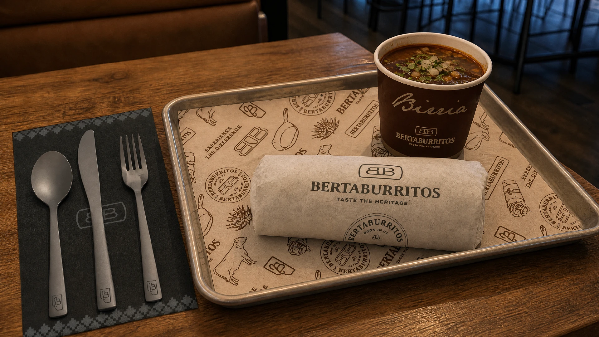
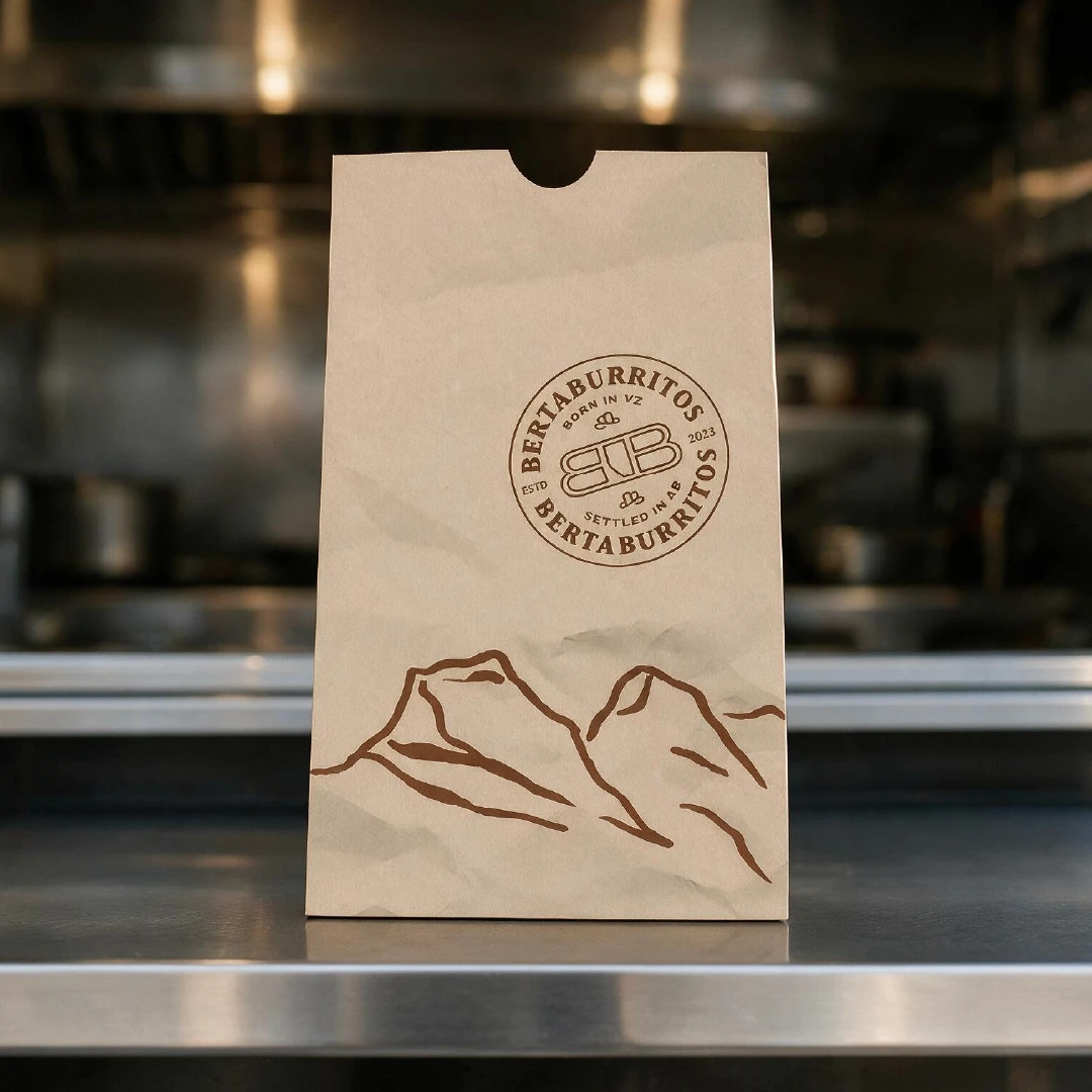
For a brand with two storefronts, it was important to develop a system that worked for either setting. Since the food truck relied so heavily on take-out containers, they had to be simple, and affordable to reproduce. However, they couldn’t lean cheap, or it would diminish the in-store experience.

The solution was simple: keep things simple.

Using one to two colors maximum kept the identity present and added value, all without breaking the bank.

Food Packaging Design

Packaging with a purpose

For a brand with two storefronts, it was important to develop a system that worked for either setting. Since the food truck relied so heavily on take-out containers, they had to be simple, and affordable to reproduce. However, they couldn’t lean cheap, or it would diminish the in-store experience.

The solution was simple: keep things simple.

Using one to two colors maximum kept the identity present and added value, all without breaking the bank.

BertaBurritos restaurant branding applied to a serving tray, burrito wrapper, utensils and drink cup
BertaBurritos branded takeout bag featuring the restaurant logo and Alberta-inspired mountain illustration
BertaBurritos branded tcoffee cup featuring the restaurant logo and custom illustrations

MERCH DESIGN

For the road home

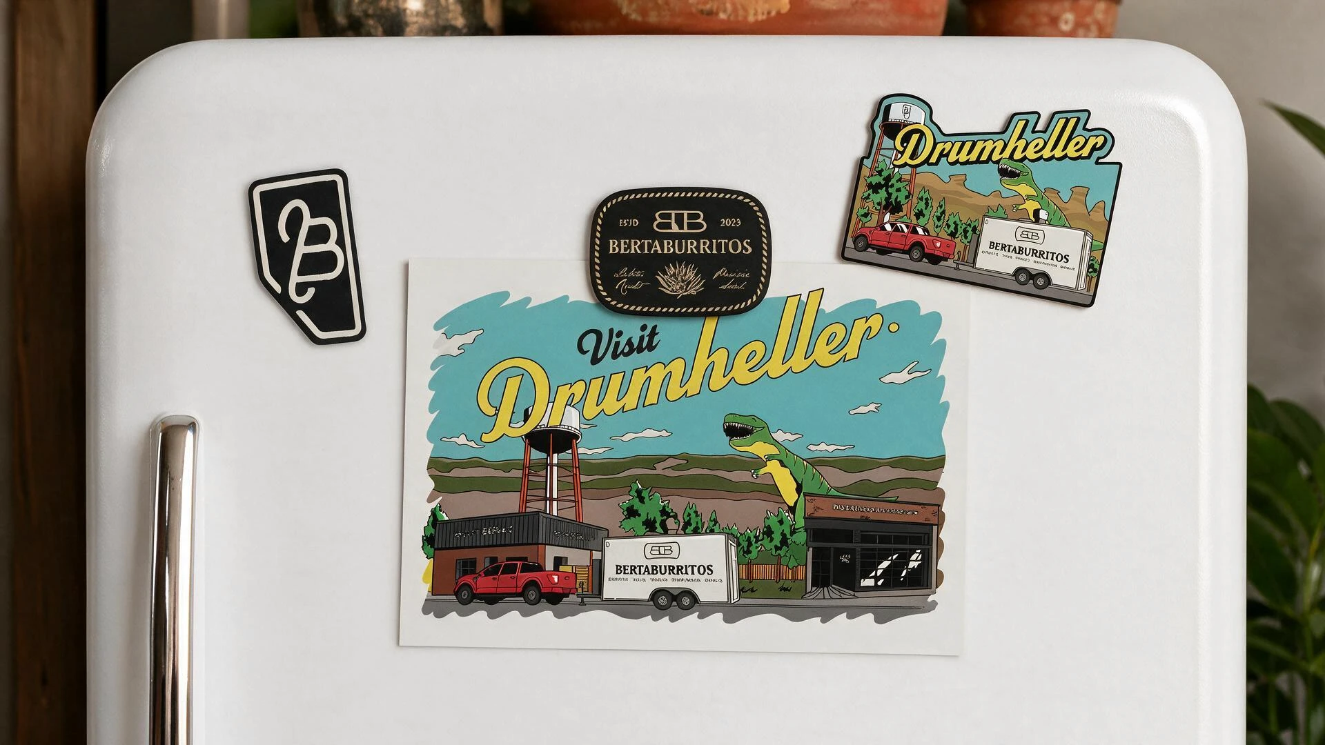
Understanding brand awareness begins away from the actual restaurant, I helped the client design several pieces of merch, with the most iconic being a comic-style postcard.

The postcard took the brand in a wildly different direction, doubling as a cross-promotional tool for the region.

Featuring some of the Drumheller Valley’s most iconic landmarks, its pop-art style may have been unexpected, but it demonstrated just how far the brand could stretch beyond its core applications.

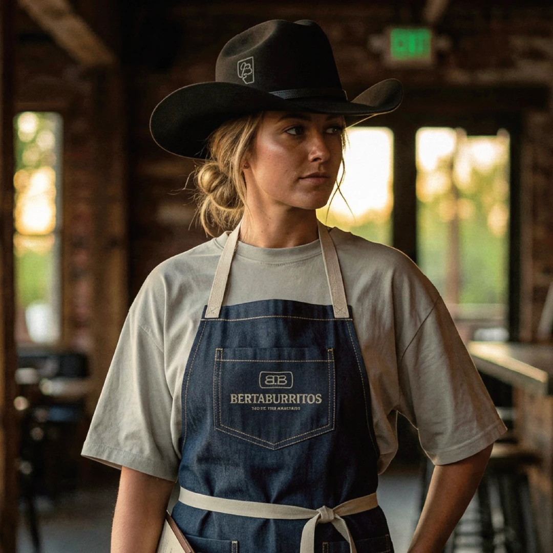
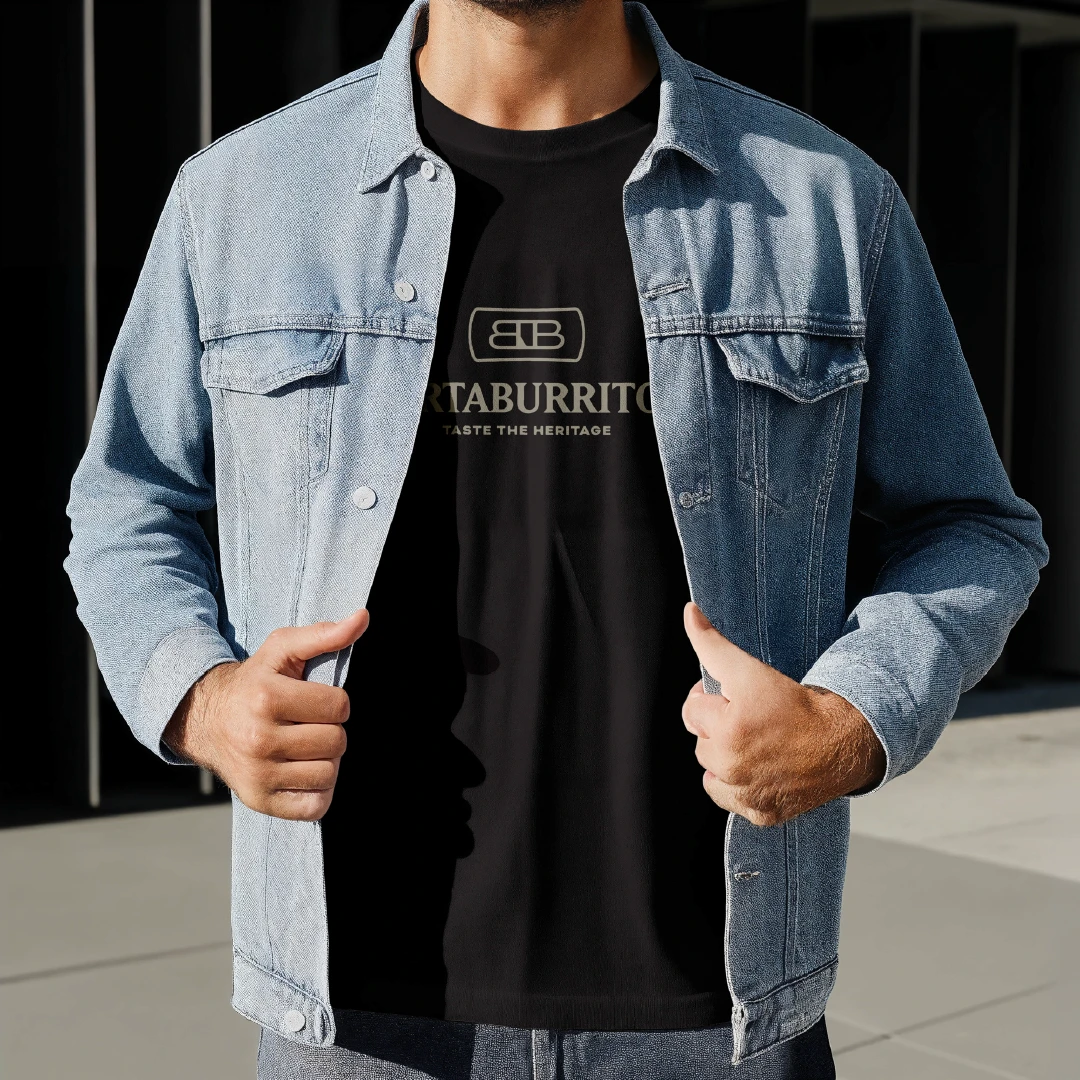
Other merchandise included magnet designs, enamel pins, and apparel for both staff and customers.

MERCH DESIGN

For the road home

Understanding brand awareness begins away from the actual restaurant, I helped the client design several pieces of merch, with the most iconic being a comic-style postcard.

The postcard took the brand in a wildly different direction, doubling as a cross-promotional tool for the region.

Featuring some of the Drumheller Valley’s most iconic landmarks, its pop-art style may have been unexpected, but it demonstrated just how far the brand could stretch beyond its core applications.

Other merchandise included magnet designs, enamel pins, and apparel for both staff and customers.

BertaBurritos merchandise featuring Drumheller postcards, magnets and branded souvenirs
BertaBurritos staff member wearing a custom branded apron and Western-inspired restaurant uniform
BertaBurritos branded apparel featuring the restaurant logo and custom staff uniform
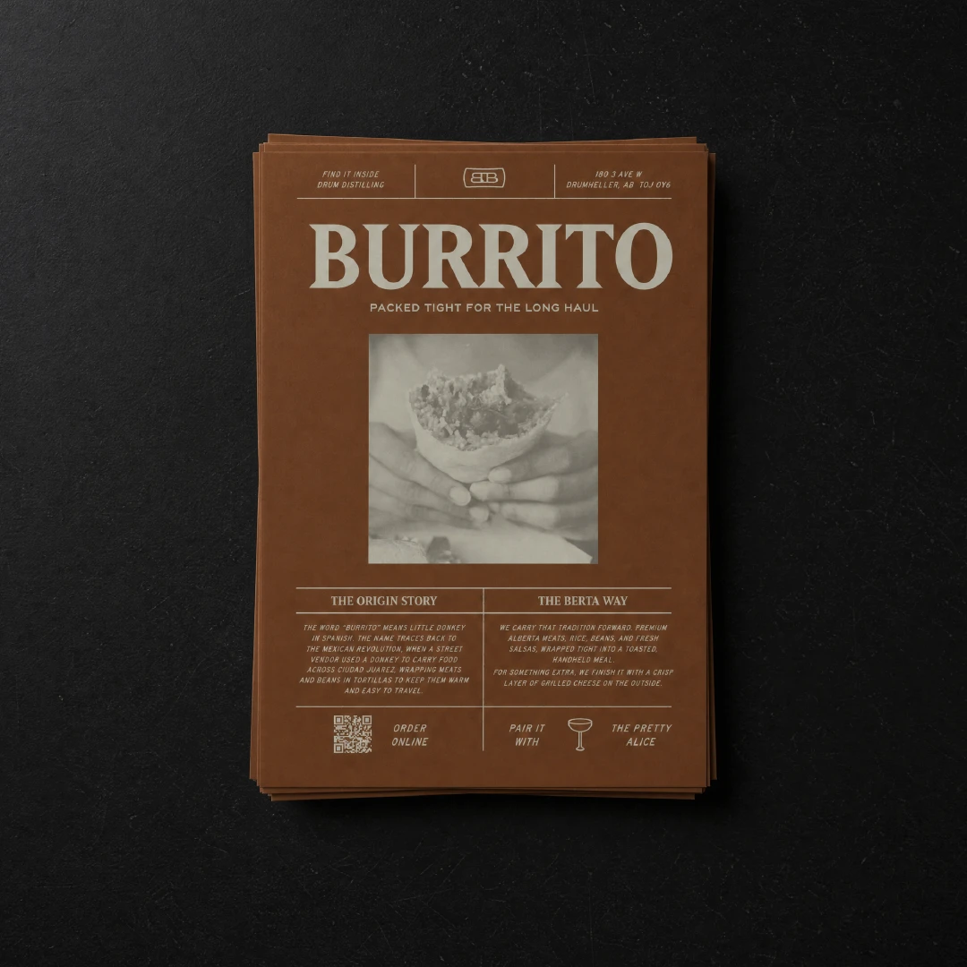
BertaBurritos burrito flyer featuring custom typography and photography
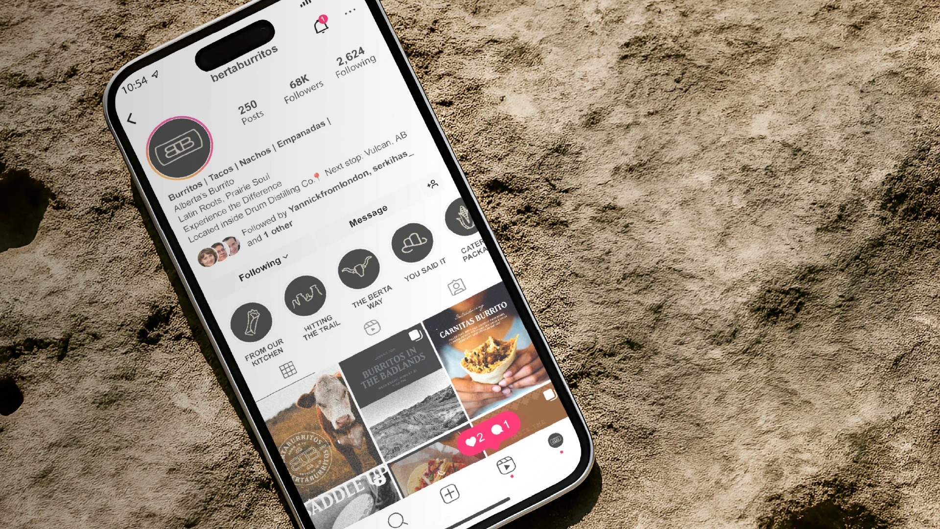
BertaBurritos social media design system featuring branded photography, illustrations and promotional graphics

WHAT HAPPENED?

THE RESULT

THE RESULT

What started as a food trailer has now become a brand built for something much bigger. BertaBurritos entered its next chapter with an identity built to match its ambitions.

Their expanded flavour-focused identity gave the business a cohesive brand system capable of moving between their food truck, restaurant, menus, packaging, signage and digital touchpoints, while bringing their Venezuelan heritage and Alberta home together under one recognizable visual language.

From a food trailer in downtown Drumheller to a permanent home inside Drum Distilling Co., BertaBurritos now has a brand built for wherever the road takes them next.

What started as a food trailer has now become a brand built for something much bigger. BertaBurritos entered its next chapter with an identity built to match its ambitions.

Their expanded flavour-focused identity gave the business a cohesive brand system capable of moving between their food truck, restaurant, menus, packaging, signage and digital touchpoints, while bringing their Venezuelan heritage and Alberta home together under one recognizable visual language.

From a food trailer in downtown Drumheller to a permanent home inside Drum Distilling Co., BertaBurritos now has a brand built for wherever the road takes them next.

WHAT ARE YOU WAITING FOR?

WHAT ARE YOU WAITING FOR?

Turn your product, story, and ambition into a brand customers recognize and trust.

Turn your product, story, and ambition into a brand customers recognize and trust.

A huge white Krentz Creative Company logo

© 2O26 Krentz Creative Co.

PRIVACY POLICY

TERMS OF USE

© 2O26 Krentz Creative Co.

PRIVACY POLICY

TERMS OF USE

© 2O26 Krentz Creative Co.

PRIVACY POLICY

TERMS OF USE